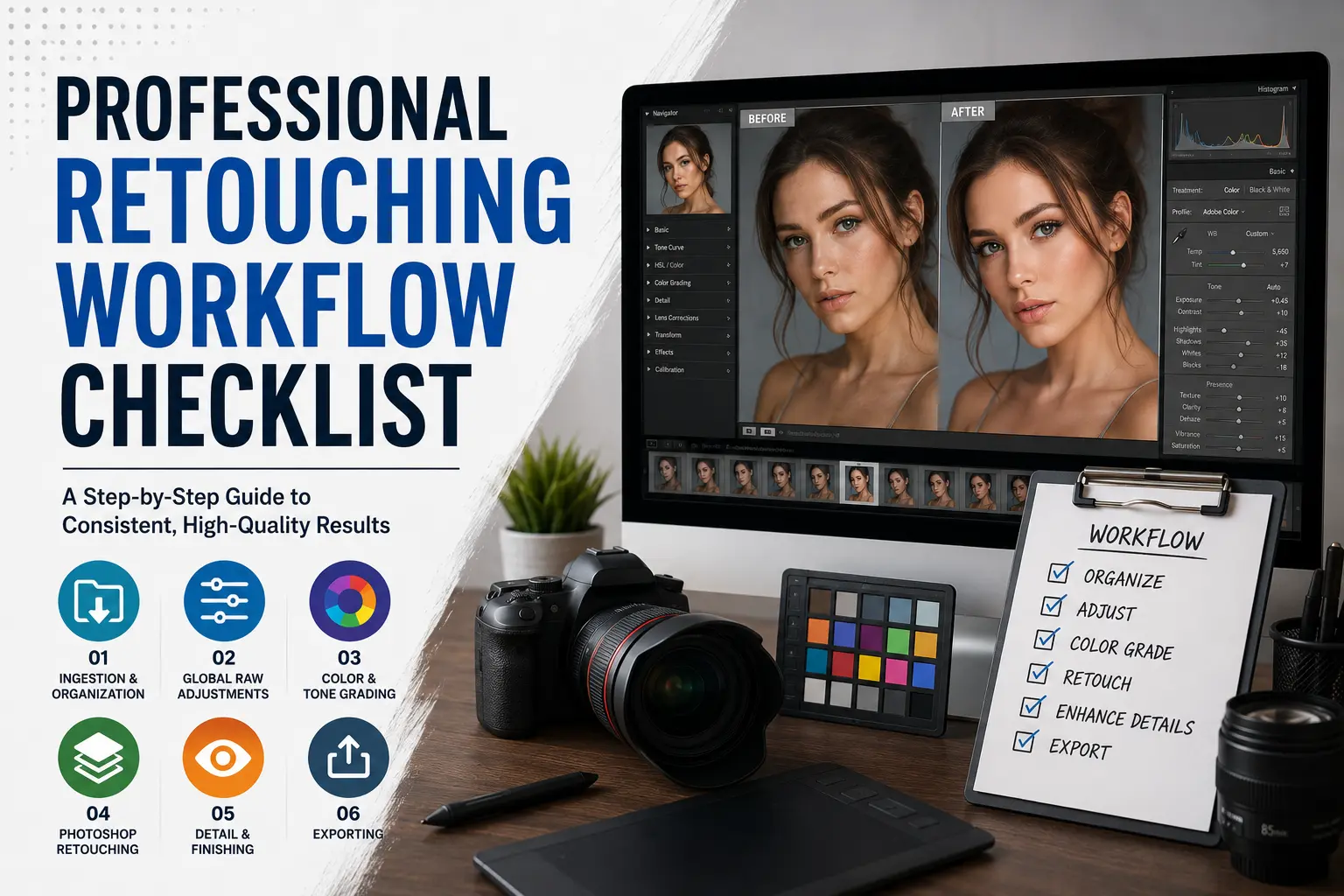
Retouching isn’t about fixing bad photos; it’s about polishing good ones. But without a structured workflow, editing can quickly become a chaotic mess of endless tweaks, lost hours, and unnatural-looking results.
We have been working as professional photo retoucher for over 10 years, and we actually know the value of retouching workflow. Workflow reduces time, cost, and most importantly, delivers the quality for clients.
The secret used by high-end commercial retouchers is a strict, non-destructive, top-down sequence. This method ensures that every edit builds upon the last, preserving image quality and making future adjustments effortless.
Think of it like building a house: you lay the foundation (RAW processing) before you paint the walls (color grading), and you don’t install the light fixtures (local sharpening) until the drywall is finished.
So, in this guide, we are going to explain the effective photo retouching workflow based on our decade of experience. Let’s start.
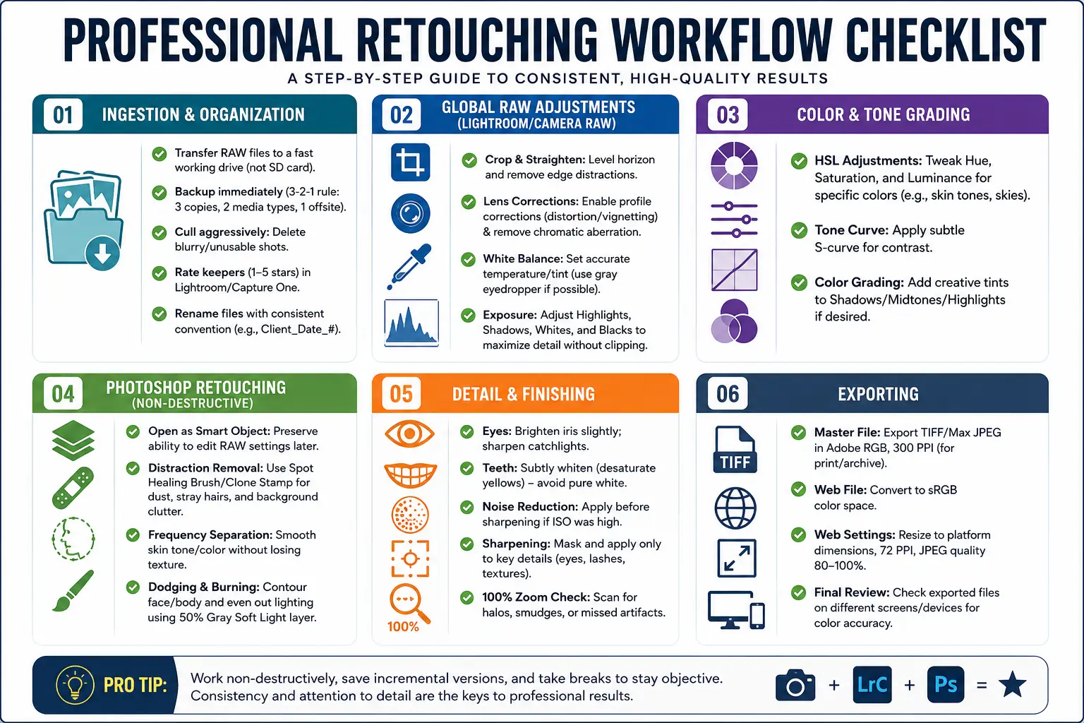
Phase 1: Ingestion & Organization
Goal: Create a clean, safe workspace before you touch a single slider.
You cannot edit efficiently if you’re drowning in thousands of unsorted files. This phase is boring but critical.
1. Import & Backup
- Transfer: Move RAW files from your SD card to a fast external SSD or internal drive. Never edit directly off the memory card.
- The 3-2-1 Rule: Ensure you have three copies of your data, on two different media types, with one offsite (cloud). If your drive fails during editing, you’re out of business.
2. Culling (The Selection Process)
- Delete the Unusable: Be ruthless. Delete blurry shots, closed eyes, or poorly exposed frames immediately. Don’t clutter your catalog with “maybe” shots.
- Rating System: Use a star rating system (1–5 stars) or color labels.
- 1 Star: Keepers.
- 3 Stars: Strong contenders.
- 5 Stars: Final selects for retouching.
- Software Tip: Adobe Lightroom Classic and Capture One Pro are the industry standards for culling due to their speed and robust metadata handling.
3. Renaming & Metadata
- Apply a consistent naming convention (e.g., ClientName_Date_SequenceNumber.RAW).
- Add keywords now while the context is fresh. It saves hours of searching later.
Phase 2: Global RAW Adjustments
Goal: Fix the technical foundation. Do this in Lightroom, Capture One, or Camera Raw.
Never skip this step. Trying to fix exposure or white balance in Photoshop is destructive and far less effective than doing it in the RAW stage.
1. Cropping & Straightening
- Reframe: Remove distracting elements from the edges.
- Level the Horizon: A tilted horizon screams “amateur.” Use the grid overlay to ensure vertical and horizontal lines are perfectly straight.
- Aspect Ratio: Set your final output ratio now (e.g., 4:5 for Instagram, 16:9 for web banners) to avoid cropping important details later.
2. Lens Corrections
- Enable Profile Corrections: This automatically fixes lens distortion (barrel/pincushion) and vignetting based on your specific camera and lens model.
- Remove Chromatic Aberration: Check the box to remove those purple/green fringes that appear along high-contrast edges.
3. Exposure & White Balance
- White Balance: Use the eyedropper tool on a neutral gray area to set accurate colors. If no gray exists, adjust the Temp/Tint sliders until whites look white, not yellow or blue.
- Tone Mapping:
- Highlights: Pull down to recover detail in bright skies or shiny surfaces.
- Shadows: Lift slightly to reveal detail in dark areas, but don’t crush them to pure black.
- Whites/Blacks: Set your true white point and black point to maximize dynamic range without clipping.
Phase 3: Global Color & Tone Grading
Goal: Establish the mood and style.
Now that the image is technically correct, it’s time to make it artistic.
1. HSL (Hue, Saturation, Luminance) Adjustments
- Hue: Shift specific colors. For example, shift greens slightly toward teal for a cinematic look, or warm up oranges for flattering skin tones.
- Saturation: Reduce saturation on distracting colors (like a bright red sign in the background) and boost saturation on key elements (like the subject’s eyes or clothing).
- Luminance: Brighten or darken specific color channels. Darkening blues can make a sky look more dramatic; brightening oranges can make skin glow.
2. Curves & Contrast
- Tone Curve: Use the RGB curve to add contrast. A subtle “S-curve” (darken shadows, brighten highlights) adds depth and punch.
- Color Grading Wheels: Use the Shadows/Midtones/Highlights wheels to inject color tints. For example, add a slight teal to shadows and orange to highlights for a popular modern aesthetic.
Phase 4: Bitmap Editing & Blemish Cleanup (Photoshop)
Goal: Remove distractions and refine details. This is where you move from Lightroom to Photoshop.
Crucial Step: Always open your RAW file as a Smart Object in Photoshop. This allows you to double-click the layer later to return to Lightroom and adjust RAW settings non-destructively.
1. Distraction Removal
- Spot Healing Brush: Best for small blemishes, dust spots, or stray hairs. Click once, and Photoshop blends the surrounding pixels.
- Clone Stamp Tool: Use for larger areas or when you need to copy texture from one area to another. Hold Alt to sample, then paint over the distraction.
- Content-Aware Fill: Select a large unwanted object (like a trash can in the background) and let Photoshop’s AI generate a replacement background.
2. Skin Retouching: Frequency Separation
This is the gold standard for professional skin retouching. It separates the image into two layers:
- High Frequency Layer: Contains texture (pores, wrinkles, hair).
- Low Frequency Layer: Contains color and tone (shadows, highlights, redness).
Why It Matters: You can smooth out uneven skin tone on the Low Frequency layer without blurring the pores on the High Frequency layer. This avoids the dreaded “plastic skin” look.
3. Dodging & Burning
- Concept: “Dodge” means lighten; “Burn” means darken.
- Technique: Create a new layer filled with 50% gray and set the Blend Mode to Soft Light. Paint with white to lighten (dodge) and black to darken (burn).
- Application: Use this to contour faces, enhance muscle definition, or even out splotchy lighting. It adds three-dimensional depth that flat lighting lacks.
Phase 5: Detail & Finishing Touches
Goal: Polish the image for final delivery.
1. Eyes & Teeth
- Teeth: Whiten teeth subtly. Desaturate the yellow/orange tones slightly and increase luminance. Warning: Do not make them pure white; natural teeth have variation.
- Eyes: Brighten the iris slightly and sharpen the catchlights (the reflection of the light source in the eye). This brings life and focus to the portrait.
2. Sharpening & Noise Reduction
- Noise Reduction: Apply this before sharpening. Use tools like Adobe Denoise or Topaz DeNoise AI if the ISO was high.
- Targeted Sharpening: Do not sharpen the entire image. Use a mask to sharpen only the eyes, eyelashes, lips, and key textures. Over-sharpening skin introduces noise and looks artificial.
3. The 100% Zoom Check
- Zoom in to 100% and scan the entire image. Look for:
- Halo effects around edges (from over-sharpening).
- Smudged textures (from aggressive healing).
- Orphaned pixels or stray hairs you missed.
Phase 6: Exporting
Goal: Deliver the right file for the right purpose.
One size does not fit all. Exporting incorrectly can ruin weeks of work.
1. Master Files (Archival)
- Format: TIFF (16-bit) or maximum quality JPEG.
- Color Space: Adobe RGB or ProPhoto RGB (wider color gamut for printing).
- Resolution: 300 PPI (Pixels Per Inch).
- Use Case: Prints, client archives, future re-editing.
2. Web/Social Media Files
- Format: JPEG (Quality 80–100%) or PNG (if transparency is needed).
- Color Space: sRGB. This is critical. Most web browsers and social platforms display in sRGB. If you upload an Adobe RGB file, colors will look washed out and dull.
- Resolution: 72 PPI (standard for screens).
- Sizing: Resize to the platform’s recommended dimensions (e.g., 1080px wide for Instagram) to prevent the platform’s compression algorithm from destroying your image quality.
Common Mistakes to Avoid
- Editing in JPEG Instead of RAW: You lose massive amounts of data and flexibility. Always shoot and edit in RAW.
- Over-Retouching Skin: Frequency separation is powerful, but less is more. Preserve natural texture. If the skin looks like plastic, you’ve gone too far.
- Ignoring Color Space: Uploading Adobe RGB files to the web results in muted colors. Always convert to sRGB for digital display.
- Destructive Editing: Never flatten your layers until the very end. Keep your PSD file with all layers intact so you can make changes later.
- Skipping the Backup: Hard drives fail. Cloud storage is cheap. Losing a client’s photos is a career-ending mistake.
Quick-Start Action Plan
- Week 1: Master culling and organization in Lightroom. Develop a consistent naming and rating system.
- Week 2: Practice global RAW adjustments. Learn to read the histogram and set proper white balance and exposure.
- Week 3: Learn Frequency Separation in Photoshop. Start with simple portraits and focus on preserving texture.
- Week 4: Master Dodging & Burning. Practice contouring faces and enhancing depth without changing colors.
- Month 2: Build your export presets. Create one preset for print (TIFF, Adobe RGB, 300 PPI) and one for web (JPEG, sRGB, 72 PPI).
This workflow scales until it does not. When the volume outgrows the hours, outsourcing photo editing keeps the same steps running with more hands on them.
Final Thoughts
A professional workflow isn’t about using expensive plugins or complex techniques. It’s about consistency, non-destructive editing, and attention to detail. By following this top-down sequence, you ensure that every image you deliver is technically sound, artistically compelling, and ready for any platform.
Stop guessing. Start structuring. Your future self (and your clients) will thank you.