Choosing the right wall color is one of the most impactful decisions you’ll make for your studio. It’s not just about aesthetics; it’s about physics. Your walls act as giant, permanent reflectors or absorbers that shape the light hitting your subject.
The golden rule for any studio wall? Finish matters more than color. Always choose a Flat or Ultra-Matte finish (0–5% sheen). Glossy or satin finishes create specular highlights and “hot spots” that are impossible to remove in post-production. A flat finish absorbs stray light, giving you total control.
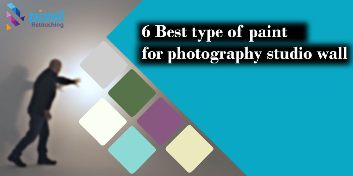
Here are the six essential wall colors every photographer should consider, along with their specific use cases.
1. Matte White: The Natural Reflector
Best For: Portraits, Newborns, Beauty, High-Key Commercial Work
White walls are essentially giant softboxes. They bounce ambient light back onto your subject, filling in shadows naturally and creating a bright, airy atmosphere.
- Pros:
- Provides beautiful, soft fill light without extra equipment.
- Makes small studios feel larger and more open.
- Ideal for high-key photography where you want minimal shadows.
- Cons:
- Light Spill: In small rooms, white walls can bounce too much light, reducing contrast and making it hard to create dramatic mood.
- Color Cast: If your lights aren’t balanced, white walls can reflect unwanted color tints onto skin tones.
- Pro Tip: Use black flags or V-flats to block light from hitting the white walls if you need more contrast.
2. Matte Black: The Light Absorber
Best For: Moody Portraits, Product Photography, Chiaroscuro, Dramatic Lighting
Black is the ultimate tool for control. It absorbs nearly all light that hits it, preventing bounce and allowing you to sculpt light with precision.
- Pros:
- Zero Light Bounce: Ensures that only the light you intentionally place hits your subject.
- Deep Shadows: Creates rich, true blacks in the background for a luxurious, dramatic look.
- Product Photography: Essential for shooting glossy items (like jewelry or electronics) where white walls would create distracting reflections.
- Cons:
- Makes small spaces feel cramped and claustrophobic.
- Requires more powerful lighting since you aren’t getting any free fill light from the walls.
- Pro Tip: Use matte black paint specifically designed for studios (like Rosco Scenic Paint) to ensure it doesn’t have a slight sheen that could still reflect light.
3. Neutral Gray (18% Gray): The Versatile Standard
Best For: General Purpose, E-commerce, Headshots, Mixed Lighting Styles
Neutral gray is the Swiss Army knife of studio colors. It strikes the perfect balance between absorbing and reflecting light. It’s dark enough to prevent excessive bounce but light enough to keep the room feeling usable.
- Pros:
- Predictable: Doesn’t add significant color casts to your subject.
- Flexible: Works well for both moderate-contrast portraits and clean product shots.
- Camera Metering: 18% gray is what camera light meters are calibrated to, making exposure estimation easier.
- Cons:
- Can look “flat” or boring if not lit creatively.
- Not ideal for extreme high-key or extreme low-key styles without additional modifiers.
- Pro Tip: Choose a mid-tone gray (around 18–20% reflectance). Avoid cool grays (blue undertones) or warm grays (yellow undertones) unless you have a specific stylistic reason.
4. Green Screen (Chroma Key Green): The Digital Background
Best For: Video Production, VFX, Virtual Sets, E-commerce Compositing
This isn’t just a wall color; it’s a tool for digital replacement. A specialized chroma green allows you to easily key out the background in post-production and replace it with any image or video.
- Pros:
- Unlimited Backgrounds: Shoot once, place your subject anywhere (beach, city, space).
- Efficiency: No need to build physical sets for every project.
- Clean Keys: Modern software makes removing green screens faster and cleaner than ever.
- Cons:
- Spill: Green light can reflect onto your subject’s edges (especially hair), requiring careful lighting and distance from the wall.
- Wardrobe Limits: Subjects cannot wear green or colors close to green.
- Pro Tip: Paint at least two coats of high-pigment chroma green paint. Ensure the wall is perfectly smooth; bumps and texture create shadows that make keying difficult. Keep your subject at least 6–8 feet away from the wall to minimize green spill.
5. Pale Blue: The Calming Cool Tone
Best For: Lifestyle Portraits, Corporate Headshots, Baby Photography, Serene Moods
Pale blue introduces a subtle cool tone to the environment. It reflects soft, cool light that can be flattering for skin tones when balanced correctly, creating a calm and professional atmosphere.
- Pros:
- Psychological Effect: Blue is associated with trust, calm, and professionalism, making it great for corporate headshots.
- Soft Fill: Like white, it bounces light, but with a cooler, softer quality.
- Unique Aesthetic: Offers a fresh alternative to the standard white/gray/black trio.
- Cons:
- Color Cast Risk: Can make skin tones look slightly cool or washed out if not white-balanced properly.
- Lighting Balance: Requires careful tuning of your light’s color temperature (often needs to be slightly warmer to counteract the blue bounce).
- Pro Tip: Choose a very desaturated, pale blue (almost off-white with a hint of blue). Avoid vibrant blues, which will strongly color-cast your subject.
6. Cream / Warm Beige: The Inviting Neutral
Best For: Family Portraits, Wedding Details, Lifestyle, Cozy Interiors
Cream or warm beige adds a touch of warmth and intimacy to the studio. It reflects light similarly to white but with a golden, inviting tone that flatters skin tones naturally.
- Pros:
- Flattering Skin Tones: The warm bounce light can enhance healthy-looking skin without heavy editing.
- Cozy Atmosphere: Creates a welcoming, home-like feel, perfect for lifestyle and family sessions.
- Versatile: Works well with both natural and artificial light.
- Cons:
- Yellow Cast: Can make whites look yellow if not monitored. Requires precise white balance settings.
- Less Contrast: Like white, it reduces contrast by filling shadows, so it’s not ideal for dramatic, moody work.
- Pro Tip: Pair cream walls with warm-toned props (wood, linen) to enhance the cozy aesthetic. Use a gray card to ensure your white balance is accurate, preventing everything from looking too orange.
Quick Comparison Table
|
Wall Color
|
Light Behavior
|
Best Use Case
|
Key Consideration
|
|---|---|---|---|
|
Matte White
|
High Reflection
|
High-key, Newborns, Beauty
|
Controls light spill in small rooms
|
|
Matte Black
|
Total Absorption
|
Moody, Product, Drama
|
Needs powerful lights; feels small
|
|
Neutral Gray
|
Balanced
|
General Purpose, Headshots
|
Most versatile; predictable results
|
|
Green Screen
|
Digital Keying
|
VFX, Video, Compositing
|
Watch for green spill on subjects
|
|
Pale Blue
|
Cool Reflection
|
Corporate, Calm Portraits
|
Balance with warmer light sources
|
|
Cream/Beige
|
Warm Reflection
|
Family, Lifestyle, Cozy
|
Monitor for yellow color casts
|
Wall colour is also the most common source of a colour cast nobody notices until the product arrives and does not match its photograph. Colour correction measures against the real item rather than the screen.
Final Recommendation: The Multi-Wall Studio
If you have the space and budget, the ultimate setup is a multi-wall studio:
- One Wall: Matte White (for bright, airy shots)
- One Wall: Matte Black (for dramatic, controlled shots)
- One Wall: Neutral Gray (for everyday versatility)
This gives you the flexibility to change the entire mood of your shoot simply by turning your subject around. If you’re limited to one wall, Neutral Gray is the safest, most versatile choice for beginners.