Most editing advice tells you to standardise: one background, one crop, one treatment. On Depop, followed literally, that advice will make your shop worse.
Depop buyers are buying from a person with taste. A grid that looks like a marketplace catalogue removes the reason they were browsing you rather than a marketplace.
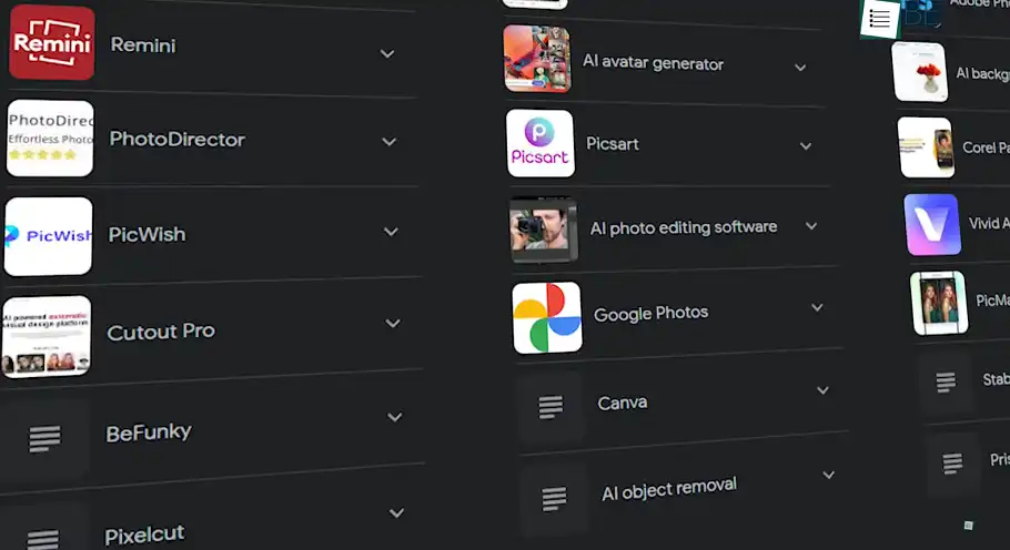
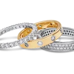
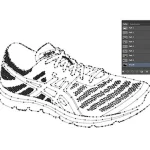
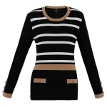
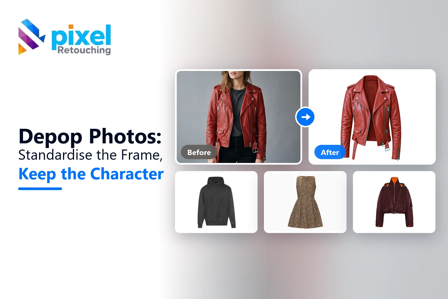
The images here are not AI output. Every before and after is real client work retouched by hand at Pixel Retouching. Drag the handle on any of them to see what is being described.
How much should you edit a Depop listing?
Enough that the item is legible and honest; not so much that the shop loses its voice. In practice: standardise the frame and the light, keep the styling and the character. Consistency should come from how things are shot and cropped, not from stripping every image back to a white cut-out.


Before
After
Consistent treatment, applied as a house style. Drag to compare.
What is worth standardising?
- Light. One spot, one time of day. This does more for a grid than any edit.
- Crop and orientation. The grid crops for you; frame so it survives.
- Colour accuracy. Not a look: the real colour of the item.
- Exposure. A grid where half the items are dark looks careless rather than moody.
What is worth keeping?
The styling, the props if they are yours, the way you shoot: on a body, on a wall, on a floor. That is your shop, and a buyer scrolling Depop is choosing between sellers as much as between items.

Before
After
Isolated, without flattening the styling. Drag to compare.
Why does on-body work so well here?
Because it answers fit and gives the item context at the same time, and because it looks like a person rather than a warehouse. It is the format Depop rewards most and the one that needs the most careful editing: correct the garment, leave the body alone.


Before
After
On-body, corrected without being reshaped. Drag to compare.
What should you not clean up?
Texture. Secondhand clothing has surface: the grain of worn denim, the pill on a knit, a crease that is part of how the fabric falls. Smoothing those is the commonest over-edit, and it makes real clothes look like renders.


Before
After
Texture kept, not smoothed away. Drag to compare.
Fuzzy edges are the same principle at the outline. A fleece cut with a hard path reads as a sticker; masking keeps the softness the camera saw.
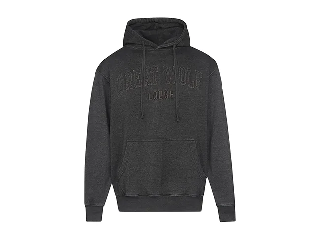

Before
After
A soft edge, kept soft. Drag to compare.
What about flaws?
Photograph them, clearly, in their own slot. A buyer who sees a marked hem in the listing and buys anyway is a buyer who will not open a dispute. Hiding it converts slightly better and costs you the sale afterwards, plus the rating.
What does a Depop listing need?
- The shop-voice image. Styled how you always style, because this is the one that makes someone follow you rather than buy once.
- The honest product shot. Whole item, clear, minimal styling – the one that answers what it actually is.
- On body, for fit and drape.
- Label and size tag, which settles the brand and sizing questions before they are asked.
- Detail or texture, close.
- Any flaw, its own frame, clearly.
Four slots is the practical minimum and eight is not too many. The pattern that works is: first image for the shop, the rest for the item.
How do you build a recognisable grid?
A Depop shop is browsed as a wall of thumbnails, and the wall is what makes someone follow. Consistency here is a look rather than a standard:
- The same surface or backdrop across listings – a floor, a wall, a sheet. It does not have to be white; it has to be yours.
- The same distance, so items sit at a similar size in the grid.
- One light. Daylight from one window, every time.
- A colour palette you stick to in props and backdrop, which is what makes a grid look styled rather than random.
None of that is retouching. It is why shooting habits beat editing habits on this platform.
Where sellers over-edit
- Heavy filters. They shift the colour of the garment, and colour is what gets resale clothing returned.
- Smoothing fabric texture until worn denim looks new, which both misrepresents the item and removes the character people are buying.
- Hard cut-outs on soft edges, which turn knitwear and fleece into stickers.
- Brightening until the item glows. The garment loses its darkest tone and reads as flat and cheap.
- Editing out a flaw that then arrives in the parcel.
Try it on three of your own
Send three listing photographs, ideally the ones you are least happy with, and we will edit them free and tell you what was holding them back.
Start a free trial: 3 images edited free. No credit card and no account required. How resale sets are handled is on Depop photo editing.