
The supplier sends you a folder. Twelve products, forty-one photos, and no two of them look like they came from the same planet: three on grey card, two on a wooden desk, one on a tiled floor with a hand in the corner, four with a watermark across the middle, and one that is a screenshot of another photo.
You can list them. Plenty of shops do. But a storefront assembled from supplier photos reads as a reseller even to a customer who could not explain why, and the reason is not image quality — it is that nothing on the page agrees with anything else.
This is how that folder becomes a set of images that look like one brand: what to check before you touch anything, the four things that actually create the branded look, and where the work is genuinely worth paying for.
The images here are not AI output. Every before and after is real client work retouched by hand at Pixel Retouching. Drag the handle on any of them to see the step being described.
What does it mean to turn a supplier photo into a branded product image?
Turning a supplier photo into a branded product image means standardising four things across every photograph you publish — the background, the product’s size and position in the frame, the colour treatment, and the shadow — so that a customer scrolling your collection page sees one coherent shop rather than a folder of other people’s photographs. It is a consistency exercise first and a retouching exercise second.
That distinction matters, because most sellers attack the wrong half. They spend an evening making one hero image beautiful and leave the other forty untouched, which produces a grid that looks worse than it did before — now there is an obvious odd one out.
Are you allowed to edit and publish your supplier’s photos?
Before any of the technique: this is the part that gets skipped, and it is the part that can cost you a listing or an account.
Buying a product does not give you the rights to the photographs of it. The images belong to whoever created them — usually the manufacturer, sometimes a photographer they hired. Every major marketplace requires you to hold the rights to what you upload, and a takedown from the rights holder is not something editing prevents. An edited copy of a photograph you have no licence to is still a copy of a photograph you have no licence to.
So the first step is administrative, not visual:
- Ask in writing. Most suppliers say yes immediately, because a reseller listing their product is why the photographs exist. Get the yes in an email and keep it.
- Read the reseller terms. Brand distributors often supply an asset pack with explicit permissions — and explicit restrictions, such as no cropping of the logo or no colour alteration.
- Treat a watermark as a signal, not an obstacle. A watermark says the owner wants to be identified. Removing one from an image you do not have permission to use is not a retouching problem, it is the wrong action. With written permission it is ordinary cleanup.
One more thing worth knowing before you invest a weekend: if forty other sellers were given the same photograph, editing it makes it look like yours but does not make it unique. Marketplaces and image search can recognise the same source image under a new background. Where a product is genuinely core to your shop, one afternoon shooting it yourself beats any amount of editing — and everything below still applies to your own photographs.
Which supplier photos are worth saving, and which are not?
Triage before you edit, because the most expensive mistake here is spending an hour on a file that could never have worked.
Reject outright:
- Too small. Below roughly 1000 px on the longest side you cannot meet Amazon’s zoom threshold, and upscaling invents detail rather than recovering it. On a textile or a printed logo the invention is visible.
- Soft at the centre. Edge softness can be lived with. A product that is out of focus in the middle cannot be sharpened — sharpening adds contrast to detail that exists, and there is none.
- Watermark over the product itself. Over the background it lifts cleanly. Over a patterned fabric or a logo, removing it means rebuilding the pattern, and the rebuild is a guess.
- Visibly not your variant. The wrong colourway or the wrong hardware is a returns problem, not an editing one.
Keep and fix: cluttered background, wrong background colour, bad white balance, dust and glare, crooked framing, product too small in frame, inconsistent scale, no shadow, wrong aspect ratio. Every one of those is routine.
What actually makes a set look like one brand?
Four constants. Fix these and mixed-source photographs read as one catalogue; get one wrong and no amount of polish saves the grid.
- One background. Same colour, every image, no exceptions. Pure white is the safe default because every marketplace accepts it.
- One scale. The product occupies roughly the same proportion of the frame each time, and sits on the same centre line.
- One colour treatment. The same white balance and contrast so a black bag is the same black in every listing.
- One shadow. The same type, direction and softness throughout — or none at all, consistently.
Write those four down as a spec before you start. It takes five minutes and it is the difference between editing forty images and editing one image forty times.
How do you get every product onto the same background?
Cut the product out and place it on your chosen background. The quality of the result lives entirely in the cut, and the cut is where automatic tools fail on exactly the products that matter — anything with a fuzzy edge, a transparent part, or a fine gap.
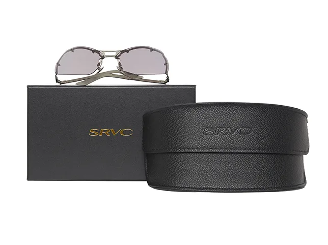
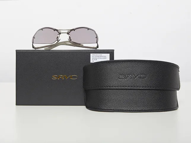
A hard-edged product on a plain backdrop is a job for a background removal service or a one-click tool, and the difference is small. A knitted jumper, a lace panel, a pair of glasses or anything with hair is where a hand-drawn clipping path earns its cost: an algorithm averages the edge, and an averaged fuzzy edge reads as a cheap cut-out even to someone who has never thought about retouching.
Before
After
Sunglasses and case moved onto pure white. Drag to compare.
Keep the transparent PNG as well as the flattened white version. The day you build a lifestyle banner or a size chart, you will want the cut-out without a background attached to it.
How do you make the product the same size in every frame?
This is the constant sellers skip, and it is the one customers feel most. If a ring fills 80% of one frame and 30% of the next, the collection page looks like a scrapbook even though both photographs are clean.
Pick one target — the product occupying about 85% of the frame is the standard, and it is also Amazon’s requirement for a main image — then crop every file to a square canvas and scale each product to that target. Straighten while you are there: a product that is two degrees off vertical looks accidental in a way nobody consciously notices. Cropping and resizing is the least glamorous step here and the one that does the most for the grid.


Before
After
Straightened and centred to a consistent frame. Drag to compare.
How do you fix colour that is wrong in the supplier’s photo?
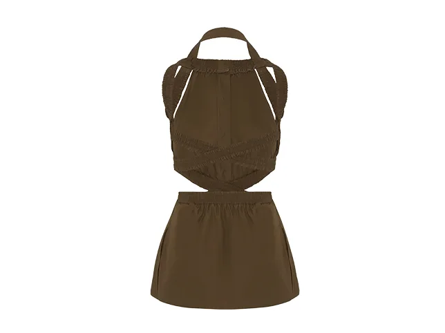
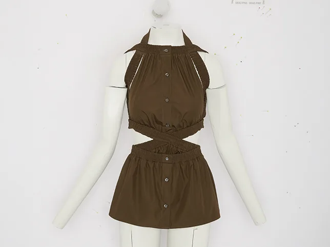
Supplier photographs are frequently shot under whatever light the warehouse had, which means a brown top arrives looking olive and a navy pouch arrives looking black. Selling the wrong colour is the single most reliable way to generate a return.
Correct against something you can verify: the actual product in daylight, a swatch the supplier sent, or a neutral surface in the frame. Do not correct until it looks nice — nice is whatever your monitor is doing today. If you have the product in hand, hold it next to the screen; that comparison is worth more than any slider.
Before
After
A top corrected to the colour it really is. Drag to compare.
Then apply the same treatment across the set, so the correction is a house standard rather than forty separate opinions. That is what colour correction means at catalogue scale.
How do you get one shadow style across the whole catalogue?
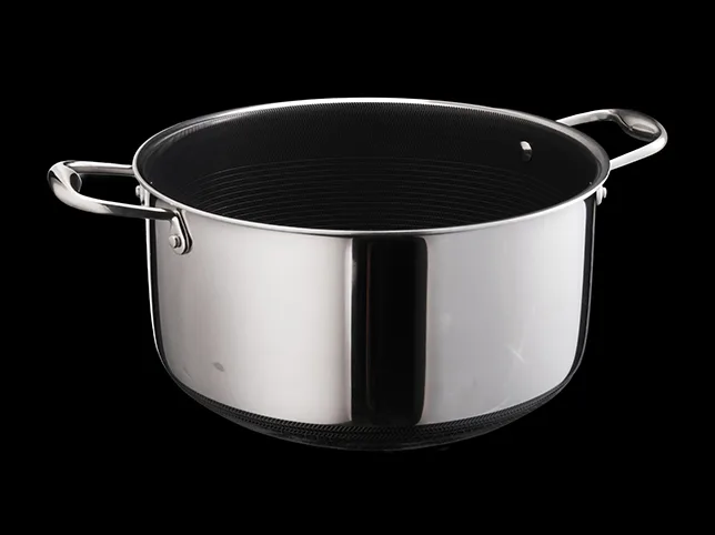
Cut a product out and it floats. A shadow puts it back on a surface, and choosing one shadow style is a branding decision as much as a technical one.
- Natural contact shadow — a small dark area where the product touches the surface. The safest default and the most convincing.
- Directional drop shadow — a cast shadow at a consistent angle. Reads more designed; must be the same angle in every image or it reads as broken.
- Mirror reflection — suits glass, jewellery and glossy electronics. Wrong on textiles.

Before
After
A natural contact shadow. Drag to compare.
Pick one and apply it everywhere. Mixed shadow styles across a collection page are the most common giveaway that images came from different sources — more so than mixed backgrounds, because a mismatched shadow implies a different light and the eye reads light before it reads colour. Our notes on shadow creation cover which type suits which product.
Can one supplier photo become every colourway?
Yes, and for dropshippers and print-on-demand sellers this is often the highest-return edit available — because the alternative is either listing a colourway with no photograph of it or waiting for the supplier to shoot one.
One photograph of a cap becomes three, each in a real colourway, with the fabric texture, the stitching and the shading intact. It works because recolouring keeps the luminance of the original and changes only the hue and saturation, so the folds still fall where the light put them.


Before
After
One cap, three colourways from a single photograph. Drag to compare.
Two limits, both worth respecting. A colour change cannot invent a texture the original does not have, so a knit cannot become a satin. And the recoloured image has to match the physical product — generating a colourway that looks slightly richer than the real one is exactly how a good conversion rate turns into a bad return rate.
How do you clean up a rough supplier photo?
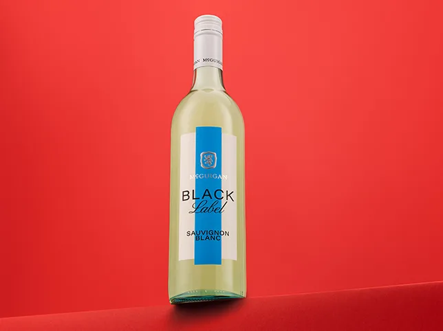
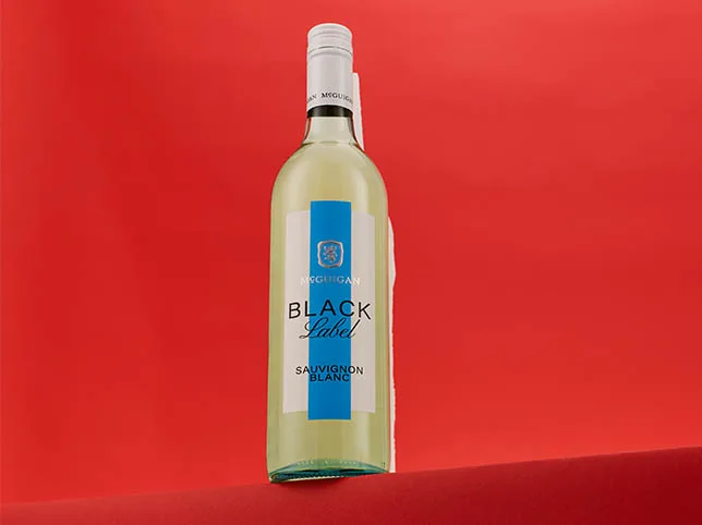
Warehouse photography brings dust, fingerprints, reflected strip lights and the occasional reflection of the person taking the picture. On a glossy or dark surface all of it is obvious at zoom.
Work in this order, because each step changes what the next one sees: correct exposure and white balance, remove dust and marks, tame glare, and only then sharpen. Sharpening first is the classic mistake — it makes every speck of dust crisper and harder to remove.
Before
After
Dust and glare removed. Drag to compare.
How do you get one edit into every platform’s crop?
The same product needs a square for a marketplace grid, a vertical for social, and something wide for a banner. Cropping the square into a vertical usually cuts the product in half.
The fix is to keep the cut-out product on its own layer and rebuild the canvas for each ratio, rather than cropping a finished flat image. Do the work once and every format is a two-minute export. This is how a TikTok Shop listing set and an Amazon gallery come out of one edit instead of three.


Before
After
Square and vertical from one edit. Drag to compare.
What about lifestyle images when you have none?
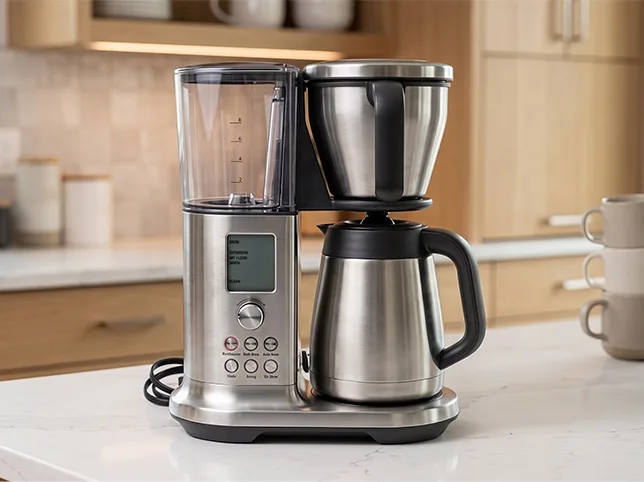
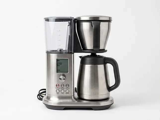
Supplier folders almost never contain lifestyle photography, and it is the content that sells hardest on a Shopify storefront and in a marketplace gallery. A cut-out product can be composited into a scene — on a desk, in a room, held — and done properly it is indistinguishable from a photograph.
Done badly it is worse than no lifestyle image at all. Three things have to agree: the direction of the light on the product and in the scene, the perspective, and the colour temperature. A product lit from the left dropped into a room lit from the right is uncanny before it is identifiable.
Before
After
A product blended into a lifestyle scene. Drag to compare.
How do you keep the look when the products keep changing?
Write a one-page image spec and reuse it. This is what a studio would call a brief, and having one is the difference between a catalogue that holds together over two years and one that drifts.
A workable spec is short:
- Canvas: 2000 × 2000 px square, sRGB, JPEG.
- Background: pure white, RGB 255, 255, 255.
- Fill: product occupies 85% of the frame, centred, vertical straightened.
- Shadow: natural contact shadow, no cast shadow.
- Colour: matched to the physical product, corrected against daylight.
- Gallery order: front, back, detail, scale, in use.
Send that with the files, whether the files are going to a freelancer, a studio or to you in three months. The product photo retouching checklist covers what to verify when the edits come back.
When is it worth paying someone else to do this?
Honestly: not always. If you have a dozen products and enjoy the work, learning to do your own cut-outs is a genuinely useful skill and the tools are cheap.
It stops being the right call at the point where three things are true at once — the catalogue is large enough that consistency is a real problem, the products are the difficult kind (textiles, transparency, jewellery, anything with a fuzzy edge), and the editing is delaying listings. A product finished and unlisted earns nothing, and that is the arithmetic that usually decides it rather than the price per image.
Per-image rates for this kind of work start at around $0.30 for a straightforward cut-out and rise with the difficulty of the edge. The full breakdown is on our price list, and if the whole catalogue is the problem rather than a few files, eCommerce photo editing is the page that describes how a batch runs.
Try it on your worst supplier photos
The fastest way to find out whether a folder is salvageable is to send the three worst files in it. Pick the cluttered one, the wrong-colour one and the one with the fuzzy edge — we will edit all three free and tell you honestly which of the rest are worth the effort.
Start a free trial — 3 images edited free. No credit card and no account required.
Frequently asked questions
Can I legally use my supplier’s product photos?
Only with permission. Buying a product does not transfer the rights to photographs of it, and marketplaces require you to hold the rights to images you upload. Most suppliers grant permission on request because reseller listings are why the photographs exist, so ask in writing and keep the reply. Editing an image you have no licence to does not make it yours.
Does editing a supplier photo make it unique?
It makes it look like yours, but it does not make it a different photograph. If the supplier gave the same file to forty sellers, image matching can still recognise the common source under a new background. For products that are central to your shop, photographing them yourself is the only real answer.
What resolution do supplier photos need to be usable?
At least 1000 px on the longest side to meet Amazon’s zoom threshold, and 1600 px or more is better. Below that, upscaling invents detail rather than recovering it, which shows immediately on fabric texture and printed logos.
Should I remove the supplier’s watermark?
Only if you have written permission to use the image. With permission, a watermark over the background lifts cleanly. Over the product itself, removing it means rebuilding whatever pattern or text it covered, and that rebuild is a guess rather than a recovery.
How do I make products from different suppliers look consistent?
Standardise four things across every image: one background colour, one product-to-frame proportion, one colour treatment and one shadow style. Consistency in those four does more for a collection page than high-end retouching on any individual photograph.
Can one product photo be turned into several colour variants?
Yes. Recolouring keeps the original luminance and changes hue and saturation, so folds, texture and shading survive. It cannot change a material, and the result has to match the physical product – a variant image that flatters the real colour produces returns.
What is the fastest way to prepare supplier photos for multiple platforms?
Keep the cut-out product on its own layer and rebuild the canvas for each aspect ratio, rather than cropping a finished flat image. One edit then exports to square, vertical and wide formats in minutes instead of being redone three times.