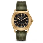

On most platforms the first photograph is the one customers see first. On Etsy it is also a ranking input — Etsy reads whether shoppers click your listing in search as evidence that shoppers want it.
That single fact changes what the first image is for, and it is why advice borrowed from Amazon makes Etsy listings worse.
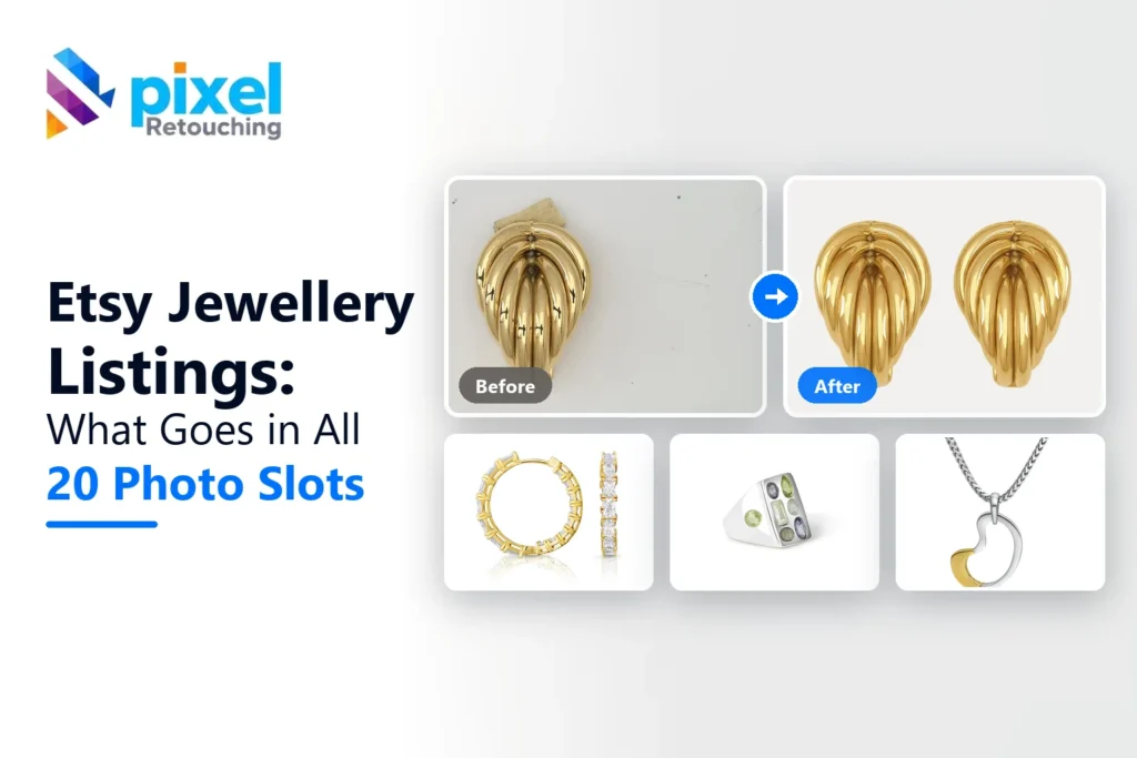
The images here are not AI output. Every before and after is real client work retouched by hand at Pixel Retouching. Drag the handle on any of them to see what is being described.
What makes a good first photo on Etsy?
One that earns a click at thumbnail size. Etsy rewards the listing shoppers choose, so the lead image is competing for attention in a grid rather than proving compliance to a scanner. A styled, characterful shot frequently outperforms a clinical white cut-out — which is the opposite of what works on Amazon.
The technical floor still applies: at least 2000 pixels on the shortest side, and Etsy gives you 20 photo slots plus a video. Note “shortest side” — a stricter way of stating it than most platforms use.

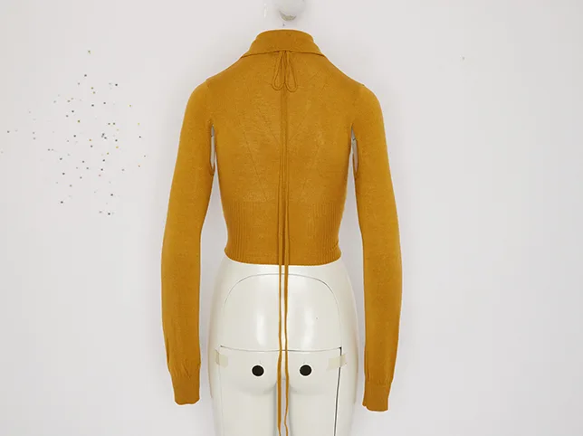
Before
After
Clean enough to read at thumbnail size, without losing the handmade feel. Drag to compare.
Why does the thumbnail crop catch people out?
Etsy crops the thumbnail differently on desktop and on mobile. A composition that is perfect in the full image can lose the product entirely in one of the two crops, and most sellers only ever check one.
The fix is framing rather than cropping: centre the piece and leave margin on all four sides, so it survives both. Recentring an existing photograph is a few minutes of work and it is the cheapest CTR improvement available.
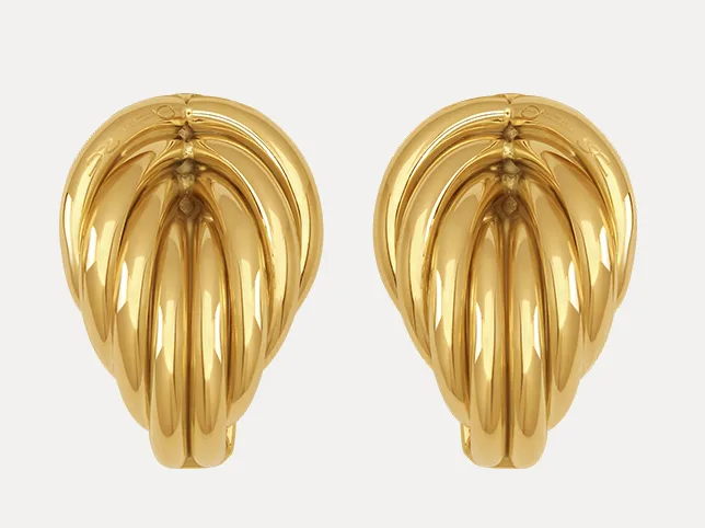

Before
After
Recentred so it survives both thumbnail crops. Drag to compare.
How much styling is too much?
Props help a lead image and hurt the rest. In the first photo a little context sells the piece; by the third or fourth, a customer is trying to see the product and the props are in the way.
A workable split: styled lead, then clean, well-lit shots that answer questions — scale, back, detail, clasp, texture. You have twenty slots. Use the first for attention and the rest for evidence.

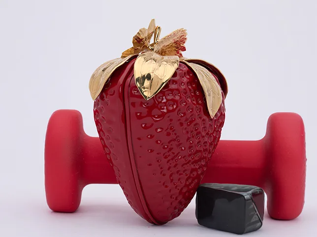
Before
After
Props removed so the product is the subject. Drag to compare.
What does handmade work need that manufactured product does not?
Two things, and both are about not over-editing.
Edges that stay soft
Handmade pieces are rarely geometrically perfect, and a hard machine cut-out flattens exactly the quality people are paying for. Fine, irregular edges need masking rather than a traced path.


Before
After
A fine irregular edge, cut without a halo. Drag to compare.
Colour that is true, not flattering
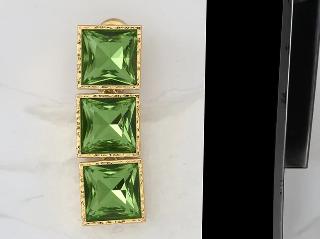
Etsy buyers return items for colour more than for anything else, and a lot of handmade work is photographed at home under mixed light — a window on one side, a lamp on the other. That cannot be fixed with one slider.

Before
After
Recovered from mixed light, corrected to the real colour. Drag to compare.
Correct against the actual item rather than against what looks nice on screen. Colour correction on a listing costs less than one return.
What goes in the twenty slots?
Etsy gives more room than any other platform and most shops use five. A workable plan:
- The click-earner. Styled, characterful, readable at thumbnail size.
- Clean product shot on a plain background, so the item is legible.
- Scale. Worn, held, or beside a coin. Non-negotiable for jewellery and small goods.
- Detail. Clasp, stitching, grain, finish.
- The other side. Back, reverse, interior.
- Variations – one image per option where you offer them.
- In context, styled the way a buyer would use it.
- Packaging, if it is part of the gift.
- Process – a shot of the work being made. This is the slot that converts on a handmade platform and almost nobody uses it.
- Sizing or care information as an image, for buyers who never read the description.
Then the video. It does not have to be produced – fifteen seconds turning the item in daylight outperforms nothing by a wide margin.
What loses Etsy sellers clicks?
- Text on the first image. It reads as an advert in a grid of photographs, and shoppers scroll past adverts.
- A dark lead image. Moody works in print and disappears in a thumbnail row.
- Every photograph from the same angle. Ten near-identical shots waste nineteen useful slots.
- No scale shot. The single commonest complaint on handmade goods, and the single easiest to fix.
- Editing colour until it flatters. Etsy returns cluster on colour. Correct it against the real item, not against what looks good.
Try it on three of your own
Send three listing photographs — ideally the ones you are least happy with — and we will edit them free and tell you what was holding them back.
Start a free trial — 3 images edited free. No credit card and no account required. There is a slot-by-slot breakdown on Etsy photo editing.