
A Shopify storefront is judged twice. Once on the product page, where a customer looks at one photograph closely, and once on the collection page, where they see twenty at a glance and decide whether this is a real shop.
Almost all the effort goes into the first view. The second is where the money is decided, and it is not a photography problem at all.
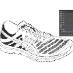
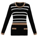
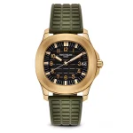
The images here are not AI output. Every before and after is real client work retouched by hand at Pixel Retouching. Drag the handle on any of them to see what is being described.
What makes a Shopify product grid look professional?
Consistency across four things, applied to every image: one background, one product-to-frame proportion, one colour treatment and one shadow style. A grid where all four hold reads as a single catalogue even if no individual photograph is remarkable. A grid where one of them drifts looks assembled from different sources, which is usually exactly what happened.
The important part: consistency is a property of the set, not of any photograph in it. You cannot inspect one image and know whether your grid is right. You have to look at the collection page.
Why does Shopify make this harder than a marketplace?
Because it accepts anything. Shopify takes images up to 5000 × 5000 pixels or 25 megapixels, under 20 MB, in nine formats, and recommends 2048 × 2048 for square product shots. It does not enforce a background, a crop or a colour.
A marketplace rejects an inconsistent image and tells you. Your own storefront simply displays it. The discipline has to be yours, which is why most stores drift: nothing ever fails.


Before
After
One background, applied as a rule rather than a preference. Drag to compare.
What breaks a grid first?
Scale
The commonest and the least noticed. If one product fills 80% of its frame and the next fills 35%, the grid looks like a scrapbook even though both photographs are clean. Pick one proportion — about 85% is the usual answer — and scale every product to it, straightening while you are there.


Before
After
Straightened and scaled to the same proportion as the rest. Drag to compare.
Background
Not “white” but one specific white. Photographed backgrounds are never the same twice, so they have to be replaced rather than corrected. Background removal starts at $0.39 an image and is the single cheapest thing you can do to a grid.
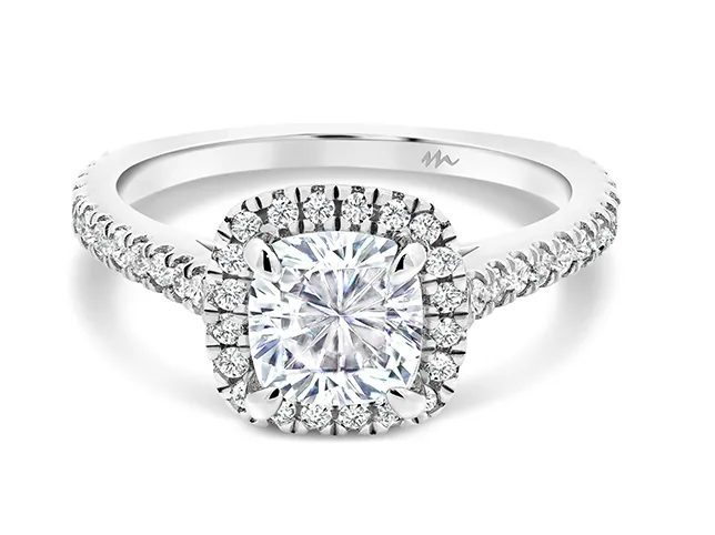

Before
After
One catalogue white across every listing. Drag to compare.
Shadow
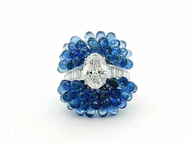
Mixed shadow styles are the clearest sign that images came from different places, because a mismatched shadow implies a different light and the eye reads light before it reads colour. Pick one — natural contact shadow is the safe default — and use it everywhere, or use none at all.

Before
After
A contact shadow that grounds the product. Drag to compare.
How do you handle variants without a reshoot?
Shopify variants want an image each, and shooting every colourway is usually not worth it. One photograph recoloured properly gives you a correct image per variant with the folds, texture and shading intact, because recolouring changes hue and saturation while keeping the original luminance.


Before
After
Three variants, one shoot. Drag to compare.
One limit worth respecting: the recoloured image has to match the product that ships. A variant that flatters the real colour converts well and returns badly.
How do you fix a storefront that has already drifted?
Not product by product. Open the collection page, pick the image that looks most like what you want the shop to be, and make that the reference. Then match everything else to it in one batch rather than correcting each listing on its own merits.
Write the reference down as four lines — background, proportion, colour, shadow — and it becomes the spec for everything you add afterwards. The full list of what to check before publishing is in the retouching checklist.


Before
After
Matched to a reference rather than judged alone. Drag to compare.
What should a Shopify product listing contain?
Six images, in this order, and the order matters because most customers never reach the end:
- The catalogue image. Clean background, standard proportion. This is the one that has to match every other product, because it is the one in the grid.
- A second angle. Back, side or open, depending on the product.
- Scale. Held, worn, or beside something known. The commonest cause of a return is a product that arrived smaller than expected.
- Detail. The material, the stitching, the finish – whatever justifies the price.
- In use or in context. The shot that does the selling rather than the describing.
- Anything specific to the product – a size chart, what is in the box, the care label.
Only the first has to obey the four constants. The rest can breathe, and they should: a listing where all six images are clean cut-outs on white answers every question except why anyone would want it.
What quietly costs a Shopify store conversions?
- Uploading straight from the camera. A 6000 px file is slow to load and Shopify will serve a resized version anyway. Export to your standard canvas first.
- Different aspect ratios across products. Shopify pads or crops to fit the theme, and a mixed set produces inconsistent whitespace that reads as sloppiness without anyone being able to name it.
- Letting the theme choose the crop. If your theme displays square and your images are portrait, the theme decides what to cut. Crop deliberately instead.
- Adding products over months without a written spec. This is how every drifted storefront got that way. The spec is four lines; the drift takes a year to undo.
- Alt text left empty. It is the accessibility requirement and the only text describing the image to a search engine. A product name and a short description of what is visible is enough.
Try it on three of your own
Send three listing photographs — ideally the ones you are least happy with — and we will edit them free and tell you what was holding them back.
Start a free trial — 3 images edited free. No credit card and no account required. Details of how a catalogue batch runs are on Shopify product photo editing.