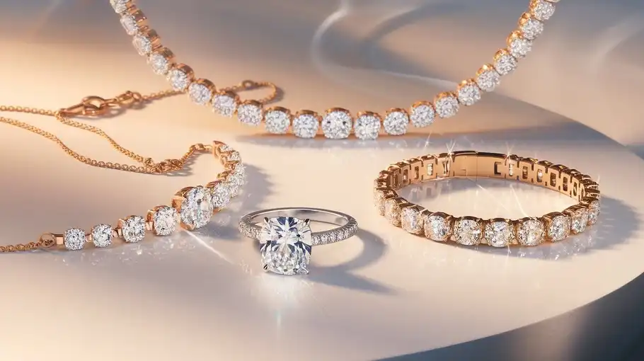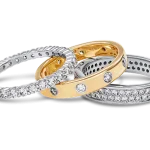
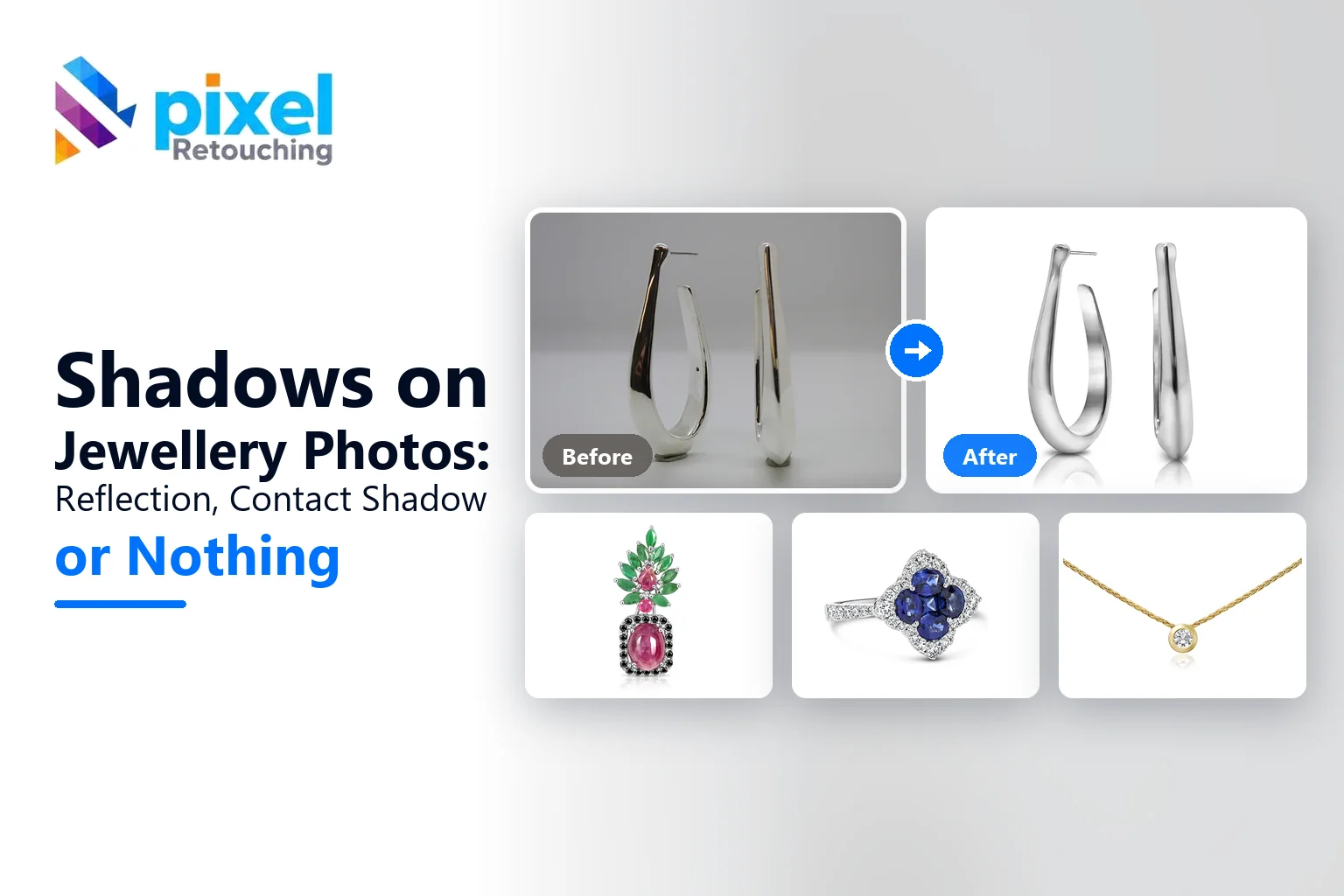
Cut a ring out onto white and something odd happens. The photograph is technically correct, clean background, sharp stone, accurate metal, and the ring looks like it has been pasted on. Nothing holds it to the page. It is a picture of a ring rather than a ring sitting somewhere.
What is missing is the thing the eye uses to decide an object is real: the mark it makes on the surface underneath it. On jewellery that mark is almost never the soft grey blob that gets added to a handbag or a pair of trainers, because jewellery is not usually photographed on a matte surface. It is photographed on something that reflects.
This is a walk through the three choices you actually have for a piece of jewellery, what each one is for, and how to tell which your product needs. Every image below is a single finished frame rather than a comparison, because the point is what the reader on your listing sees, not the difference between two versions of it.
These images are not AI output.
Every photograph on this page is real client work, retouched by hand by the team at Pixel Retouching. We have used our own portfolio rather than generated examples, because on a page about whether a shadow looks real, generated shadows would be a strange thing to illustrate with.
First, what nothing looks like
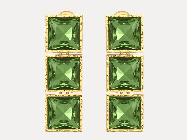
Worth seeing plainly, because it is the default and it is more common on listings than either of the alternatives. A cut-out with no shadow is not wrong. It is simply a decision, and most of the time it is a decision nobody made.
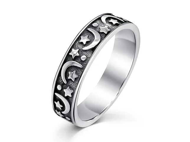
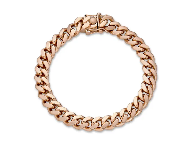
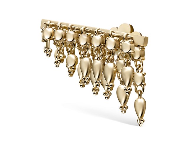
Use nothing when: you are filling an Amazon main image slot, where a shadow can work against the pure white requirement and nothing else is allowed in the frame. Also when your grid is already busy: forty thumbnails each with their own shadow read as noise at small sizes.
The cost: depth. On a flat piece you will not miss it. On anything with height, layers or moving parts, the piece flattens into a silhouette of itself.
The mirror reflection: what jewellery usually wants
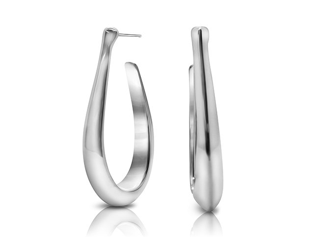
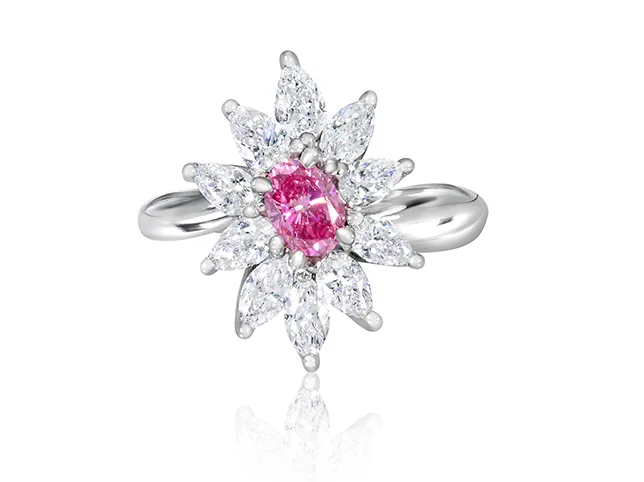
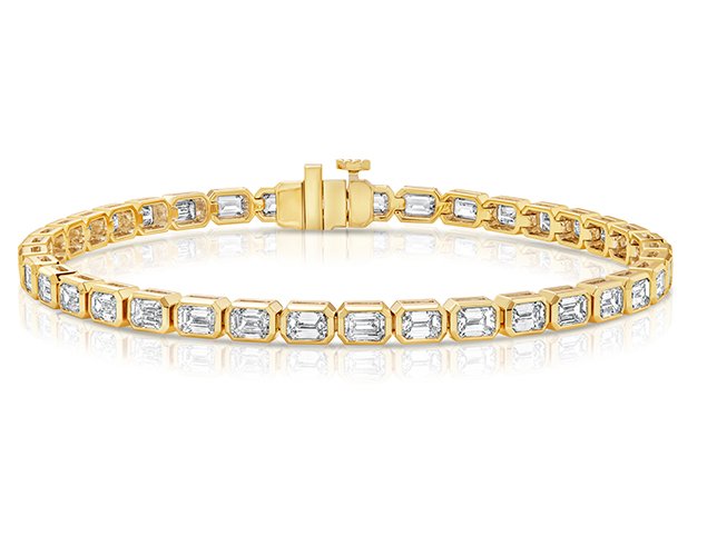
A reflection puts the piece on a polished surface: glass, acrylic, a black gloss tile. It is by far the most common finish in jewellery e-commerce, and the reason is not fashion. It is that jewellery is small, and a reflection doubles the amount of the frame the product occupies without making the product bigger.
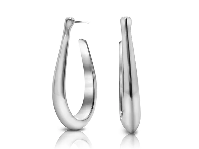
What makes a reflection convincing:
- It is a true vertical flip of the piece, aligned exactly at the point the piece touches the surface. If any text or asymmetry reads the correct way round in the reflection, it is not a reflection.
- It fades, and it fades fast. A third of the product’s height is about right. A reflection that runs the full height looks like a second piece of jewellery.
- It is dimmer and slightly less saturated than the piece. Real reflective surfaces lose light.
- It does not get its own highlights. A reflection that sparkles independently is the fastest way to make a piece look rendered.
Use a reflection when: the piece is small, when it hangs, when it is highly polished, or when the shop is positioned as luxury. It is the default for rings, earrings and pendants and it is what most jewellery buyers now expect to see.
The contact shadow: when weight matters more than shine
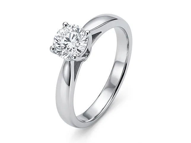
A contact shadow puts the piece on a matte surface instead. It is darkest and sharpest exactly where the metal touches, then opens and lightens as it moves away. Where a reflection says polished, a contact shadow says solid.
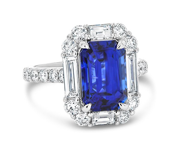
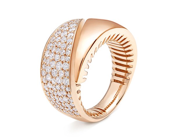
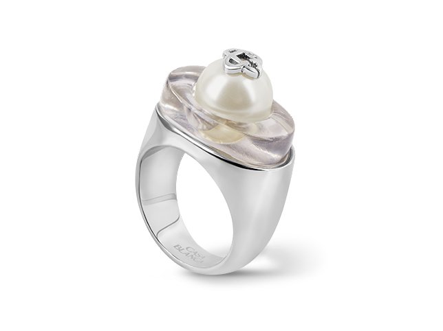
What makes a contact shadow convincing:
- It touches. A soft grey oval that never meets the metal makes the piece hover, which is worse than no shadow at all.
- It follows the real footprint. A ring is hollow; its shadow is hollow. A solid blob under an open piece is the single most common tell.
- It is scaled to the object. Small objects cast small, tight, relatively sharp shadows. An oversized soft shadow makes a ring look the size of a plate, because softness reads as distance.
- It is light. On a white background the shadow has to stay light enough that the background still reads as white, which is a real constraint on marketplaces.
Use a contact shadow when: the piece is matte, textured, organic or heavy: pearls, raw stones, oxidised silver, hammered finishes, chunky bands. Also when the shop’s whole look is natural and hand-made rather than polished and luxury, because a mirror reflection fights that.
The problem underneath all three: your background is not white
This one is worth checking before you spend any time on shadows at all, because it makes every other decision look wrong.
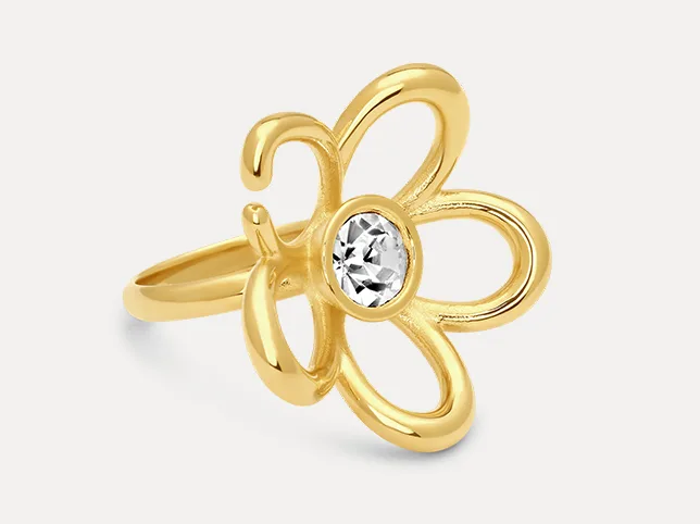
A background at 250 or 252 rather than 255 looks perfectly white on its own and becomes a visible grey rectangle the moment it sits on a marketplace page. It also makes any shadow you add look heavier than it is, because there is less distance between the shadow and the background it is sitting on.
Check it with a colour picker at the four corners, not by eye. If you are already cutting pieces out, this is part of the same job: see background removal for how the two go together.
Why you rarely see a directional cast shadow on jewellery
On furniture and footwear, a long shadow thrown to one side is a normal treatment. It suggests a room, a time of day, a real place. You will almost never see it on jewellery, and the reason is worth understanding rather than just following.
A cast shadow needs a single, fairly hard light source to exist, and jewellery is shot under the opposite of that: a large diffuse source or a light tent, precisely so that the metal does not pick up hard specular hits and the stones do not blow out. A cast shadow added afterwards therefore contradicts the lighting visible on the piece itself, the highlights say soft and broad, the shadow says hard and directional, and the eye catches the disagreement even when the viewer cannot name it.
The exception is a campaign or editorial image where the whole frame is styled and lit for that effect, and the shadow was really there. Adding one to a catalogue cut-out is not the same thing.
Choosing, in one pass
If you have a piece in front of you and no strong opinion:
- Is it going in an Amazon main image slot? Nothing. Pure white, product only.
- Is the surface polished and the piece small? Reflection.
- Does it hang: earrings, pendants, chains? Reflection. It shows the drape at no extra cost.
- Is it matte, textured, organic, or a pearl? Contact shadow.
- Is it heavy, wide, or tall? Contact shadow, so the weight reads.
- Is your shop’s look hand-made rather than luxury? Contact shadow, or nothing.
Then, whichever you pick: use it on the whole collection. A grid where some pieces reflect and others sit on a shadow looks like two shops. Consistency across the set matters more than which one you chose.
Doing it yourself
The reflection is the one worth learning, because it covers most jewellery and it is mechanical rather than artistic. Duplicate the cut-out piece onto its own layer, flip it vertically, align it exactly at the contact point, apply a small Gaussian blur, drop the opacity to somewhere around a quarter, then mask it with a linear gradient so it fades out within about a third of the piece’s height. Our walk-through of jewellery retouching in Photoshop covers the surrounding steps.
Where it stops being mechanical: a piece with an opening, where the reflection has to show through the gap the same way the piece does. A chain, where the reflection has to keep the links readable at a size where they are already only a few pixels. And any piece where the surface it is reflecting in would realistically pick up colour from the metal: gold does not reflect as a neutral grey.
That is the point at which most shops hand it over. Our shadow creation service builds reflections and contact shadows to one spec across a whole set, which is the part that is genuinely hard to do consistently by hand, and it sits alongside the rest of our jewellery retouching.
Frequently asked questions
Should jewellery photos have a shadow or a reflection?
A reflection for most polished pieces, especially rings, earrings and pendants. A contact shadow for matte, textured or heavy pieces such as pearls, oxidised silver and hammered bands. Neither on an Amazon main image, where the rules want the product alone on pure white.
Why does my jewellery look like it is floating?
Because the shadow has no contact point. A real shadow is darkest and sharpest exactly where the metal meets the surface. A soft grey shape underneath, not touching, reads as hovering, and it looks less real than no shadow at all.
How dark should a shadow be on a white background?
Light enough that the background still reads as white when the image sits on a marketplace page. If the shadow is the first thing you notice in the thumbnail, it is too strong.
Can I use a reflection on Amazon?
Not on the main image, which wants the product alone on pure white. On secondary images you have much more freedom, and a reflection there is fine.
Why do my reflections look fake?
Usually one of three things: the reflection is not a true vertical flip, it does not fade fast enough, or it has its own highlights. The second is the most common: a reflection that runs the full height of the piece stops reading as a reflection and starts reading as a second object.
Does the shadow have to match across a whole collection?
Yes, and it matters more than which treatment you chose. A collection page where some pieces reflect and others cast a shadow looks like stock from two different suppliers.
See it on your own pieces
If you are not sure which treatment suits your work, send three photographs through the free trial and say what you are unsure about. A retoucher edits them by hand and sends them back within 24 hours. No card, and you keep the files either way. A polished piece, a matte one and something that hangs is a good three to send, because those are the three that want different answers.