
A TikTok Shop image has roughly the size of a postage stamp and the attention span of a thumb moving at speed. It is not a catalogue photograph and the things that make a good catalogue photograph do not help it.
The images here are not AI output. Every before and after is real client work retouched by hand at Pixel Retouching. Drag the handle on any of them to see what is being described.
What makes a good TikTok Shop product image?
One that is readable at thumbnail size on a moving screen. That means the product fills the frame, the contrast is strong enough to survive a small bright display, and there is nothing in the picture the eye has to sort through. Subtlety is a desktop luxury.
Why does filling the frame matter more here?
Because the image is smaller than anywhere else you sell. A product sitting neatly in the middle of a generous white frame is a well-composed photograph and an unreadable thumbnail — the product ends up a few millimetres across.

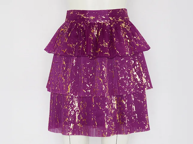
Before
After
Filled the frame, because the frame is tiny. Drag to compare.
Why does contrast need to be stronger?
Phone screens are bright, often outdoors, and the scroll gives an image a fraction of a second to register. A flat, tasteful grade that looks refined on a monitor turns into grey mush in that fraction of a second.
The point is not to over-saturate. It is that the product must separate from its background instantly, which usually means lifting contrast at the edges rather than globally.

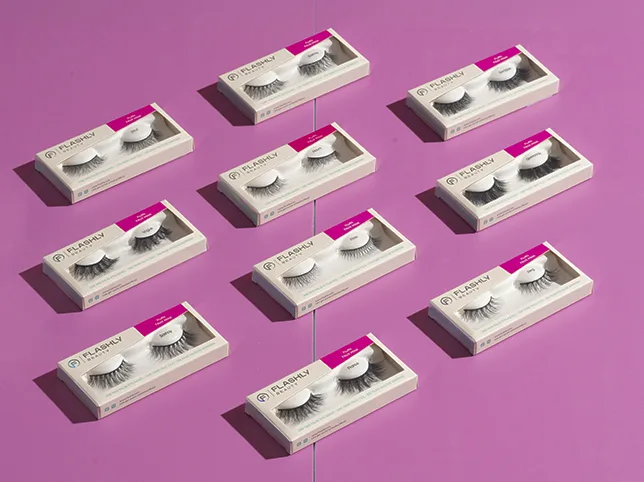
Before
After
Contrast that survives a moving screen. Drag to compare.
How do you get square and vertical from one edit?
TikTok is vertical and the shop grid is square, so the same product needs both. Cropping a finished square into a vertical usually cuts the product in half.
The answer is to keep the cut-out product on its own layer and rebuild the canvas for each ratio rather than cropping a flat image. Do the work once and each format is an export.


Before
After
Square and vertical from one edit. Drag to compare.
What about the rest of the gallery?
The lead image earns the tap. The rest answer the questions that decide the purchase, and on TikTok those skew practical: how big is it, what does it look like in a hand, what is it actually made of.

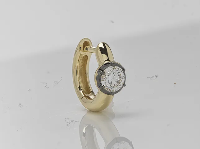
Before
After
A detail shot that shows detail. Drag to compare.
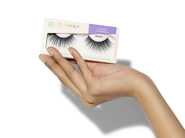

Before
After
In-hand, for scale. Drag to compare.
Why does the whole range need the same treatment?
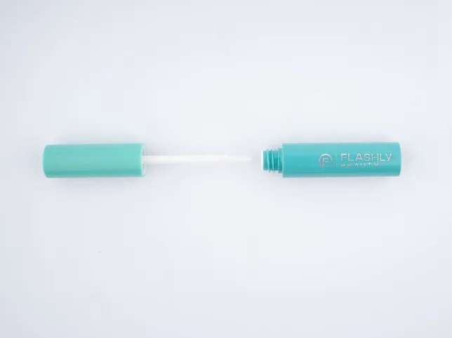
Because TikTok shoppers arrive at your shop from a video, not from a search, and they scroll the range in one sitting. A range edited over months at different settings reads as several sellers.

Before
After
One treatment across the range. Drag to compare.
What does a TikTok Shop gallery need?
Fewer images than a marketplace, each doing more work:
- The thumbnail. Product filling the frame, high contrast, nothing else in it.
- In hand or worn. Scale and reality, which is what a video-led audience is checking.
- The detail that justifies the price.
- What you actually receive – everything in the box, laid out. This kills the “is this the whole thing” question that stops a fast purchase.
- A lifestyle frame that matches the video the buyer arrived from.
The last point is the one most sellers miss. If the video showed the product on a desk in warm light and the listing shows it on clinical white, there is a half-second of doubt about whether it is the same item – and a half-second is expensive on this platform.
Why does the listing have to match the video?
Because the traffic is not searching, it is arriving mid-scroll from a specific piece of content. The customer has already formed an impression of the product from the video; the listing either confirms it or contradicts it.
Practically that means editing the product images to sit alongside the creative rather than against a generic catalogue standard – the same colour treatment, the same kind of light, the same version of the product.
What goes wrong most often?
- Catalogue images reused unchanged. They are composed for a desktop product page and disappear in a phone grid.
- Portrait images cropped to square by the platform, cutting the product in half. Produce the square deliberately.
- Text in the image. At thumbnail size it is unreadable, and it competes with the product for the only attention you get.
- A range edited at different times. Video traffic browses your whole shop in one sitting, so inconsistency is more visible here than anywhere else.
Try it on three of your own
Send three listing photographs — ideally the ones you are least happy with — and we will edit them free and tell you what was holding them back.
Start a free trial — 3 images edited free. No credit card and no account required. More on preparing a shop set is on TikTok Shop photo editing, and the ratio work is cropping and resizing.