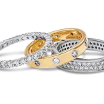

Most jewellery images are not rejected for one big mistake. They are rejected for a halo along a chain, a gold that has drifted warm, or a diamond that has been sharpened into a white blob — each of which looked fine on a laptop at 30% zoom and looked wrong the moment a customer pinched to zoom on a phone.
This is the checklist we run before a jewellery file leaves the studio. Fourteen checks, in the order that catches the most for the least time, with a real before and after for each so you can see the defect rather than read a description of it.
The images here are not AI output. Every before and after is genuine client work retouched by hand at Pixel Retouching. Drag the handle on any of them to see the check being described.
What is a jewellery image quality-control checklist?
A jewellery image quality-control checklist is a fixed set of visual and technical checks applied to every retouched product photo before it is published, covering the cut-out edge, metal colour, stone rendering, dust, shadow, batch consistency and the marketplace’s own file rules. It exists because jewellery is judged at 100% zoom, where errors that are invisible at thumbnail size are the whole picture.
It differs from a general product photo retouching checklist in what it weights. A trainer or a kettle forgives a soft edge and a slightly cool white. A pavé ring does not: the piece is small in frame, mostly specular, and every one of its defects is magnified by the zoom the customer is guaranteed to use before spending four figures.
What are the fourteen checks, in short?
The full list, for anyone who wants it before the detail:
- Edge — the cut-out holds at 100% with no halo or fringe.
- Fine detail — chains, prongs and openwork are followed, not smoothed over.
- Metal colour — gold reads as gold, not as yellow.
- Collection match — the same alloy is the same colour across every image.
- White balance — mixed lighting has been resolved, not averaged.
- Dust — nothing survives at full zoom.
- Stone transparency — translucent stones still transmit light.
- Facets — diamonds read as cut stones, not white shapes.
- Lustre — polished metal, not plastic.
- Shadow — the piece sits on the surface rather than floating.
- Reflection — if there is one, it agrees with the surface and the light.
- Marketplace rules — background, fill and pixel size pass the automated check.
- File — dimensions, format and colour space are right.
- Truth — it still looks like the piece in the box.
Is the cut-out edge clean at 100% zoom?
Zoom to 100% and walk the outline. You are looking for three specific failures: a pale halo where the old background was feathered rather than cut, a coloured fringe where the selection took a pixel of the backdrop with it, and a stair-stepped edge where an automatic tool traced a curve in straight lines.
All three come from the same cause — a selection made by contrast rather than by hand. A hand-drawn clipping path has none of them, because a path is a curve rather than a per-pixel decision, and it can be pulled a hair inside the metal where an algorithm would sit a hair outside it.
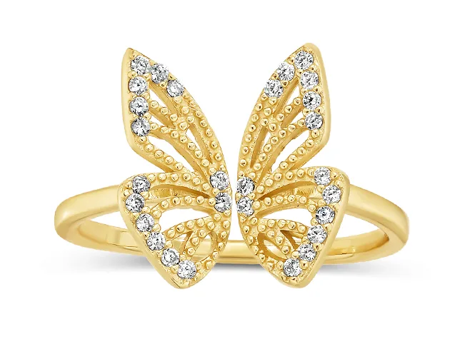
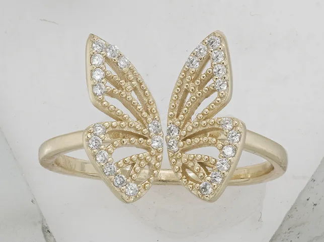
Before
After
A pavé ring cut out with a hand-drawn path. Drag to compare.
Have the fine edges actually been followed?
The edge check passes on the silhouette. This one is about what happens where the silhouette gets difficult: the gap inside a cuff, the space between a chain’s links, the four thin prongs holding a solitaire, the pierced work in a filigree pendant.
The failure mode is not a rough edge, it is a missing hole. Openwork gets filled in, links fuse into a rope, prongs thicken. The piece is still recognisable, which is exactly why this one gets shipped: nobody notices a lost negative space unless they are looking for it, and the customer holding the returned item notices immediately.

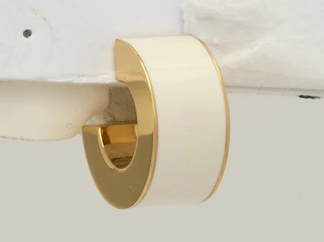
Before
After
A gold cuff isolated along its fine edge. Drag to compare.
Is the metal the right colour, or just bright?
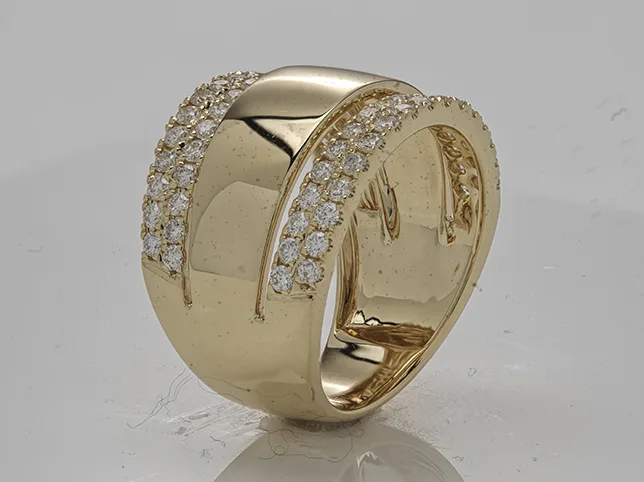
Yellow gold, rose gold and brass separate by hue, not by brightness, and the quickest way to ruin all three is to correct exposure and call it colour. A lifted, desaturated yellow reads as brass. An over-warmed one reads as costume jewellery. Rose gold that loses its pink becomes yellow gold, and you have just misdescribed the product.
Sample the metal with the eyedropper rather than judging it by eye — your eye adapts to whatever is on screen within seconds. Compare the reading against a physical reference or a shot of the piece next to a colour target. This is the check that colour correction exists for.
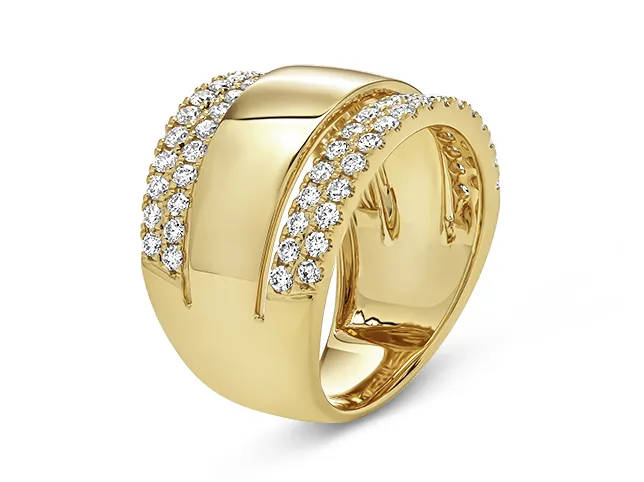
Before
After
A wide band corrected to a true gold. Drag to compare.
Does the metal match across the whole collection?
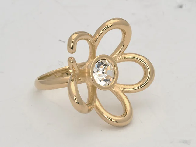
An image can pass every check on its own and still fail on the grid. Open the collection page and look at the row, not the file: if the same 18k yellow appears in four different temperatures across four listings, the shop looks unreliable even though no single photograph is wrong.
This is the check that catches editing done over months rather than in a batch. Fix it by nominating one image as the reference for each alloy and matching every other file to it, rather than correcting each one to look good alone.

Before
After
A ring matched to a reference gold. Drag to compare.
Has the white balance survived mixed lighting?
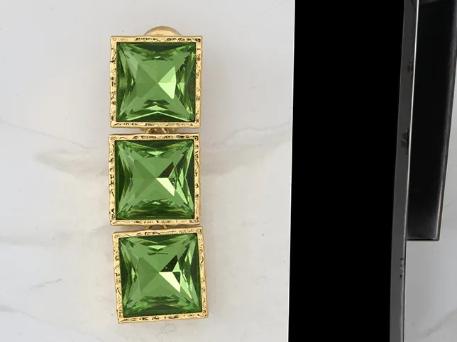
Mixed light is the usual cause of a colour cast that survives correction: a window on one side and a tungsten lamp on the other put two different colour temperatures on one piece, and a single white-balance move cannot fix both. Correct for the window and the shadow side goes orange. Correct for the lamp and the highlight goes blue.
Check by looking at what should be neutral — the white background, a grey card, the un-plated inside of a band. If neutral is not neutral, the file needs local correction rather than a global slider, and green gemstones are where you will notice it first because green sits between the two casts.

Before
After
Green gemstone earrings recovered from mixed light. Drag to compare.
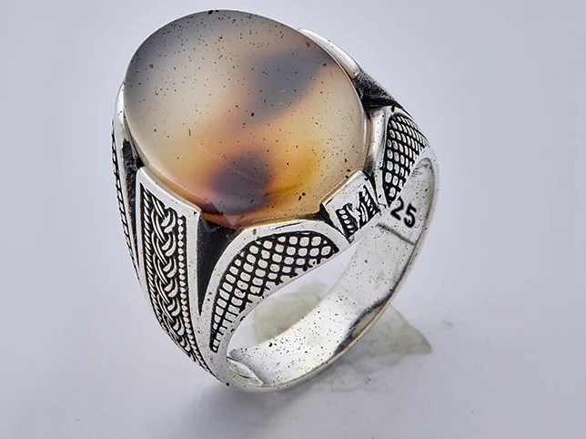
Is every speck of dust gone at full zoom?
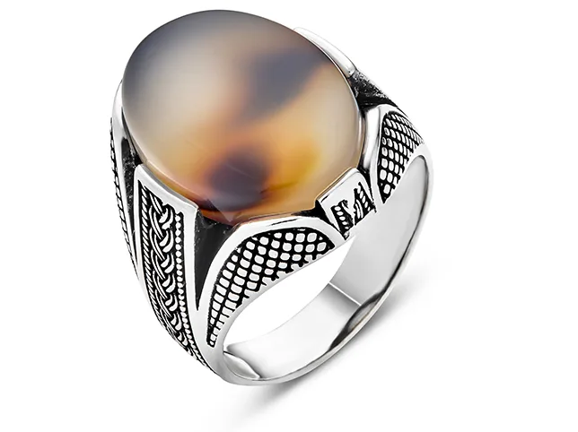
Jewellery is a dust magnet and macro is a dust microscope. At 1:1 you will find lint on the band, a fingerprint on the bezel, polishing compound in the setting and a hair that was invisible through the viewfinder.
Run this check systematically rather than by scanning: view at 100%, then move across the frame in a grid so no area is skipped, and pay particular attention to the transition between metal and stone, where compound collects and where a clone stamp is most likely to leave a smear that is worse than the dust.
Before
After
An agate signet ring with the dust removed. Drag to compare.
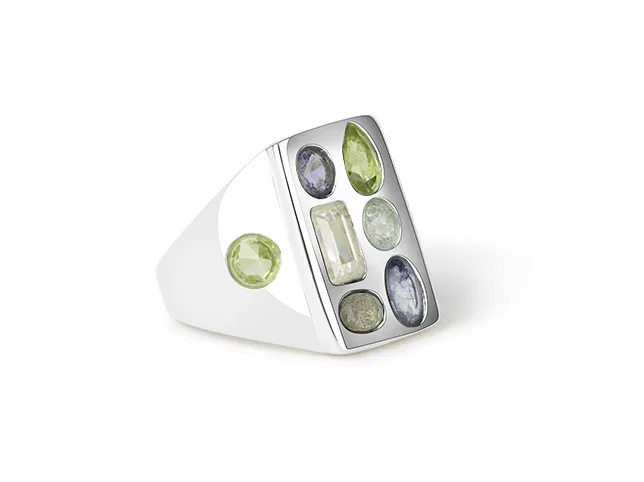
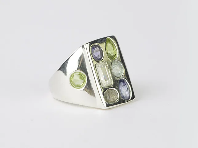
Do the stones still look transparent?
The commonest damage done to a translucent stone is done while cutting it out. An emerald, an opal, a moonstone or a piece of sea glass is partly transparent, so its edge is not a hard boundary — it carries background through it. Mask it as if it were metal and you get a stone that looks painted on.
The test: does light appear to pass through the stone, or only bounce off it? A correctly handled translucent stone keeps a slight variation across its body and a brighter zone where light exits. A flattened one is a single even colour with a hard rim.
Before
After
A translucent gemstone ring masked without flattening. Drag to compare.
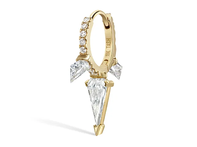
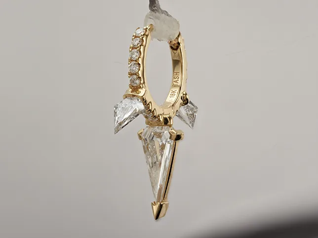
Do the diamonds read as facets, not white blobs?
A cut diamond is a structure of small mirrors. Photographed well it shows a pattern of light and dark facets; over-brightened or over-sharpened it collapses into one white shape with a halo, which is what most listings show and what makes a real stone look like cubic zirconia.
Check for clipped whites. If the highlight has no detail left, the facet structure has been destroyed, and no amount of sharpening brings it back — sharpening only adds contrast to an edge that no longer exists. Recover the highlight first, then judge the sparkle.
Before
After
Diamond drop earrings finished at full zoom. Drag to compare.
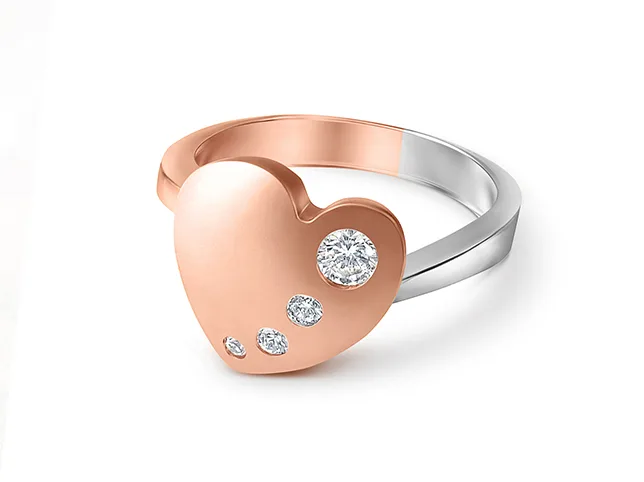
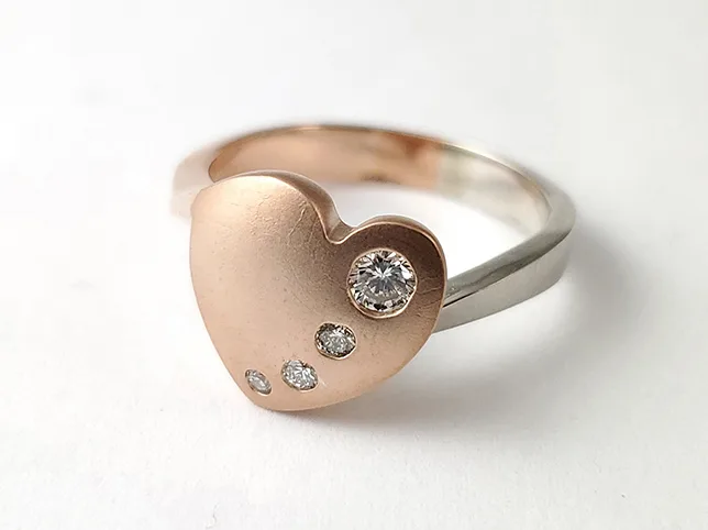
Is the lustre polished metal, or plastic?
Polished metal has a specific signature: a hard-edged specular highlight, a fast falloff into a mid-tone, and a dark band where the surface curves away. Remove the dark band while cleaning — which is what happens when you dodge a surface evenly — and the metal reads as moulded plastic.
So the check is not “is it bright”. It is “does it still have its darkest tone”. If a polished ring has no genuine dark on it anywhere, it has been over-lifted, and that is what jewellery retouching is meant to protect rather than remove.
Before
After
A rose gold ring brought to a polished lustre. Drag to compare.
Is the piece grounded, or floating?
Cut a ring out cleanly and drop it on white and it hovers. There is no contact point, so the eye reads it as a sticker rather than an object with weight. A small, tight contact shadow under the point where the piece meets the surface fixes it, and a large soft drop shadow usually does not — it just adds a grey smudge.
Check the shadow against the light in the image. If the highlight is top-left, the shadow cannot fall to the top-left as well. On a marketplace main image, check the rules first: a shadow is allowed on a pure white background, but it must not read as a second object.


Before
After
A diamond ring given a shadow that grounds it. Drag to compare.
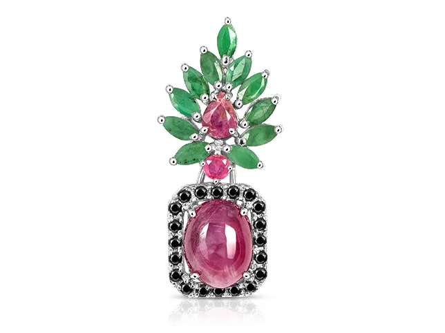
Does the reflection agree with the surface?
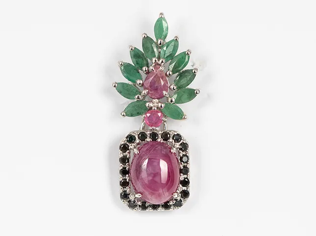
A reflection is a stronger sales cue than a shadow for pendants and earrings, and a faster way to look fake. Three things have to be true: the reflection is a mirror of the piece and not a copy of it, it fades with distance rather than ending in a hard line, and it is dimmer than the object by a visible margin.
Reflections also have to be a decision, not a habit. A piece shot on linen or stone should not have one, because those surfaces do not reflect — and a reflection on a matte surface is the single clearest sign that a photograph has been assembled rather than taken.
Before
After
A pendant given a natural shadow and reflection. Drag to compare.
Will it pass the marketplace’s automated check?
This one is not aesthetic and it is not negotiable, because the check is run by software before a human ever sees the listing.
- Amazon main images need a pure white background at RGB 255, 255, 255 — not 253, which is close enough to the eye and not close enough to the scanner — with the product filling at least 85% of the frame, a minimum of 1000 px on the longest side to enable zoom, and 1600 px recommended. No text, logos, watermarks or inset images on the main slot. See our notes on Amazon product photo editing for the rest of the specification.
- Etsy wants at least 2000 px on the shortest side, and crops the thumbnail differently on desktop and mobile, so the piece must survive both. There is a full breakdown in our guide to Etsy photo editing.
- Shopify is permissive on background, which means the discipline has to come from you rather than from the platform — and a consistent Shopify product grid is worth more than any single image on it.
Before
After
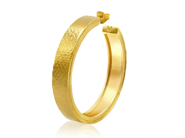
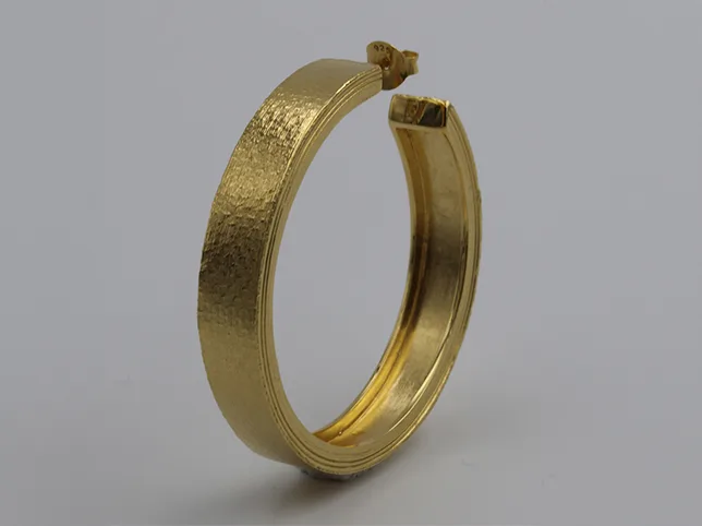
Macro jewellery retouching for a marketplace listing. Drag to compare.
Is the file itself right?
The last technical gate, and the one most often failed by a file that looked perfect on screen:
- Colour space is sRGB. An Adobe RGB file uploaded to a marketplace renders dull and slightly desaturated in most browsers, and the seller usually blames the retouching.
- Dimensions are large enough for zoom on the platform in question, and the same across the set.
- Format matches the job — JPEG for a flat background, PNG where genuine transparency is needed. A PNG of a white background is a large file doing a JPEG’s work.
- Layers are flattened and the crop is consistent, so the piece sits at the same scale in every image of the set.
Does it still look like the piece in the box?
The final check is the one no software performs. Put the retouched image next to the actual item and ask whether a customer receiving it would feel they had been shown the truth.
Retouching that removes dust, corrects a colour cast and cuts a clean edge is presenting the piece accurately under good light. Retouching that removes a genuine inclusion, deepens a sapphire past its real saturation or slims a band is describing a different product — and it converts well right up until it produces a return, a refund and a review that costs more than the sale.
Where the difference is genuinely hard to judge, the useful question is not “is this allowed” but “would I be comfortable showing the customer both files”.
Before
After
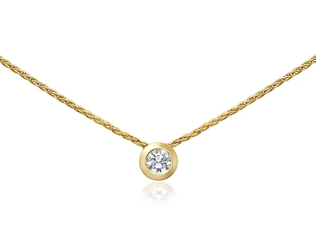
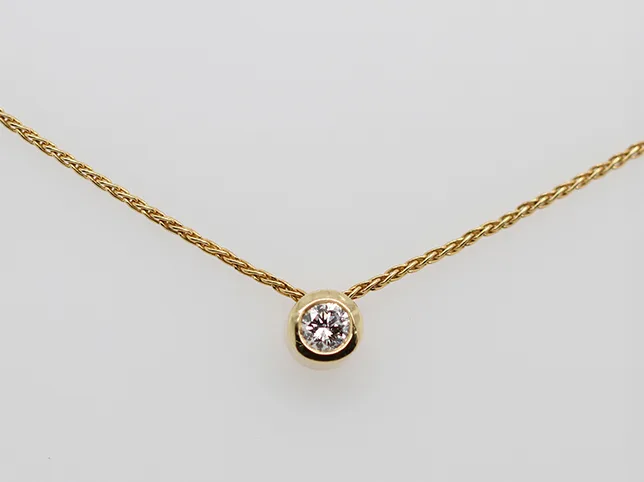
A bezel-set pendant retouched for a listing. Drag to compare.
How do you run this without it taking longer than the edit?
Fourteen checks per image is unworkable as a linear list. Run it in three passes instead, each at a different zoom, because each zoom level reveals a different class of defect:
- Fit to screen, five seconds. Composition, crop, shadow, floating, gross colour. Anything wrong here is wrong enough to see instantly.
- 100%, thirty seconds. Grid across the frame for edges, dust, facets, transparency and lustre. This pass finds most of what gets rejected.
- The grid, once per batch. Open the collection view and check consistency, scale and metal match across every image at once. Never check consistency one file at a time — consistency is not a property a single image has.
A batch of forty runs in well under an hour that way. Doing it in one pass per image takes twice as long and misses the batch-level problems entirely, which are the expensive ones.
Who should own the checklist — you or your editor?
Whoever publishes. If you retouch in house, it is your last gate. If you outsource jewellery retouching, the studio should be running it before delivery and you should still spot-check the first batch against it — not because a studio cannot be trusted, but because the checklist is also how you communicate what you care about. A studio that knows you check facet structure will treat facet structure differently.
Send the list with your first brief. It is a faster and more precise way to describe a house style than any amount of adjectives, and it converts a subjective review into a specific one: “check 8 failed on images 3, 7 and 12” is actionable in a way that “these look a bit flat” is not.
Before
After
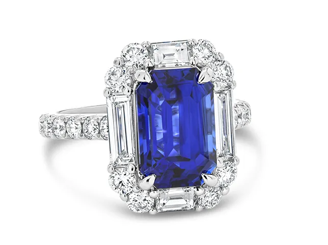
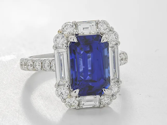
A sapphire ring finished for a campaign frame. Drag to compare.
Try the checklist on your own images
The quickest way to find out whether your current images pass is to have three of them run through this list by someone who does it daily. Send your three hardest files — a pavé setting, a translucent stone, a mirror-polished band — and we will retouch them free and tell you which checks they were failing.
Start a free trial — 3 images edited free. No credit card and no account required.
Frequently asked questions
What is the most common defect in jewellery product images?
A halo or fringe along the cut-out edge, caused by selecting the product automatically by contrast rather than cutting it with a hand-drawn path. It is invisible at thumbnail size and obvious at the 100% zoom customers use before buying, which is why it survives review and then reaches the listing.
How many megapixels do jewellery product images need?
Enough for the platform’s zoom, not more. Amazon enables zoom at 1000 px on the longest side and recommends 1600 px; Etsy asks for 2000 px on the shortest side. For jewellery, work larger than the delivery size so that a macro crop is still sharp, then export down to the platform requirement.
Should jewellery images have a shadow on a white background?
A small contact shadow, yes, on almost every piece. Without one a cut-out ring floats and reads as a sticker rather than an object. A large soft drop shadow usually adds nothing but grey. Check the marketplace’s own rules for the main image slot before adding anything.
How do you keep gold consistent across a whole collection?
Nominate one image per alloy as the reference and match every other file to it, rather than correcting each image to look good on its own. Consistency is a property of the grid, not of a single photograph, so it has to be checked in the collection view.
Can AI retouching pass this checklist?
Parts of it, reliably: dust removal, background replacement and global colour on simple pieces. The checks it fails most often are the fine-edge check on chains and openwork, translucent stone masking, and facet structure on diamonds, where automatic tools tend to flatten or clip. Those are the checks worth running by hand.
What is the difference between retouching and misrepresenting a piece?
Retouching presents the item accurately under good light: dust removed, colour cast corrected, edge cut cleanly. Misrepresentation changes what the customer will receive, such as removing a genuine inclusion, deepening a stone past its real saturation, or altering proportions. The practical test is whether you would be comfortable showing the customer both files.